
How We Turned a Curated Stone Collection Into
Your Website Should Show It
Boutique natural stone import and supply
Architects and designers, builders and fabricators, high-end homeowners
Warana, Sunshine Coast, QLD
Brand identity and logo, website design, and development
The
Situation
Glenn Fail, the owner, called us on 16 October 2025. He had recently started Natural Stone Co. and he wanted two things: a logo and a website.
What he already had was harder to buy. Two decades specifying and sourcing stone on the Sunshine Coast. Direct relationships with quarries overseas. A collection he had selected slab by slab rather than ordered by the container. Relationships with the builders who matter locally.
What he did not have was anything online that proved it. There was a site live at the time, but it did the same thing most stone supplier sites do: it showed product. It did not show provenance, judgement, or the person behind the selection.
For a business where a single slab can define an entire room, that is the difference between being shortlisted and being skipped.
The Selection
Path
We designed the site around one sequence, from first impression to enquiry. We call it the Selection Path.
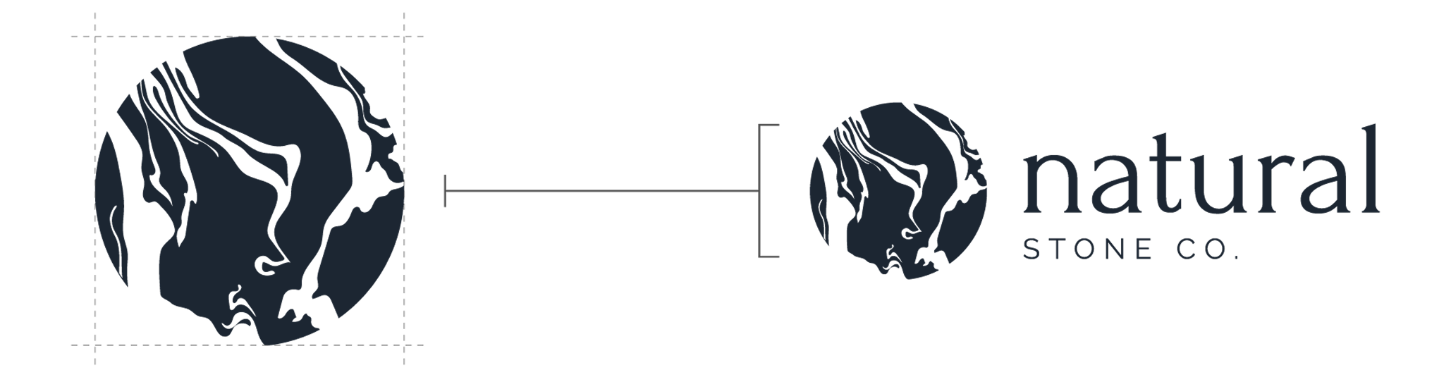
Brand identity that feels like the material
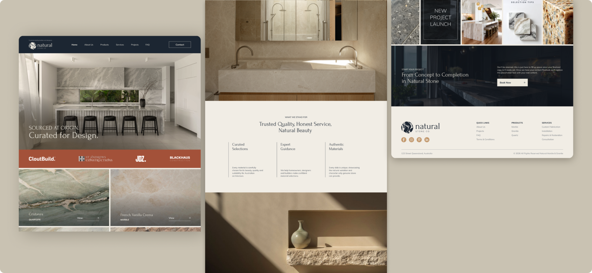
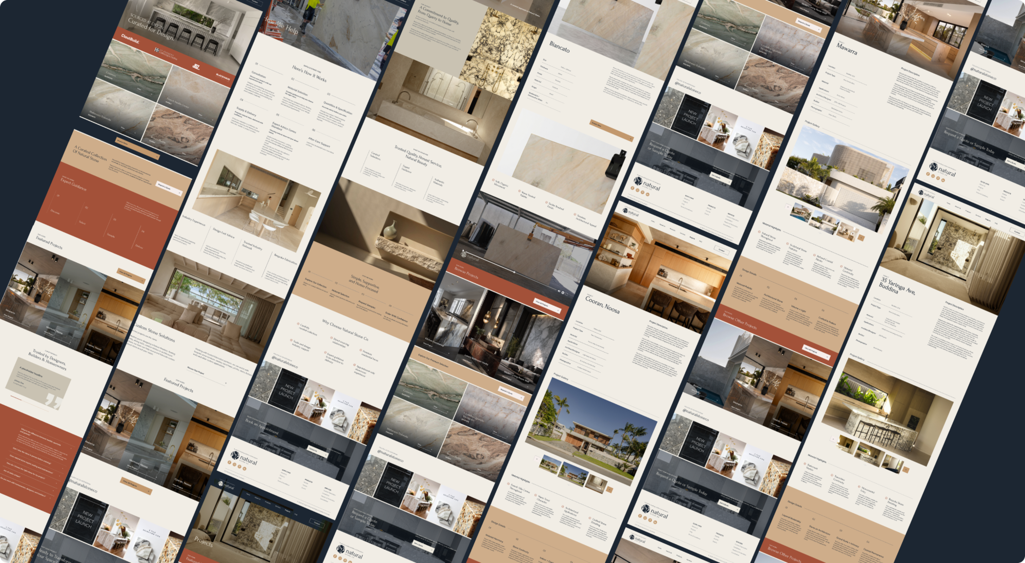
The logo mark draws on natural stone veining. Headlines use a classical, unhurried serif treatment. Body copy sits in a clean architectural sans. The palette runs deep slate for authority, terracotta and rust for warmth and earth connection, cream and gold for light and permanence.
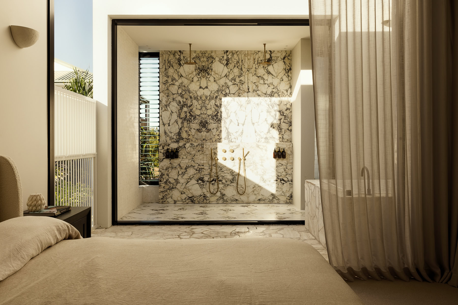
A voice, documented
What he did not have was anything online that proved it. There was a site live at the time, but it did the same thing most stone supplier sites do: it showed product. It did not show provenance, judgement, or the person behind the selection.
Proof placed before the ask
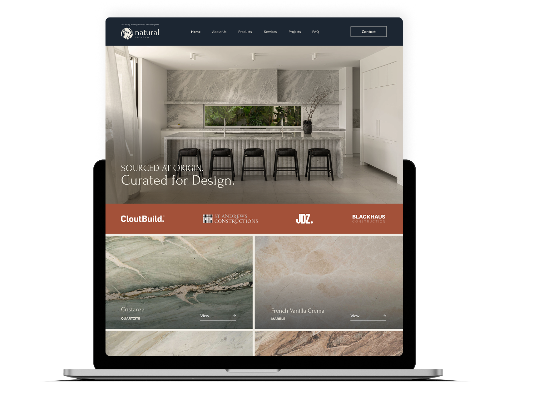
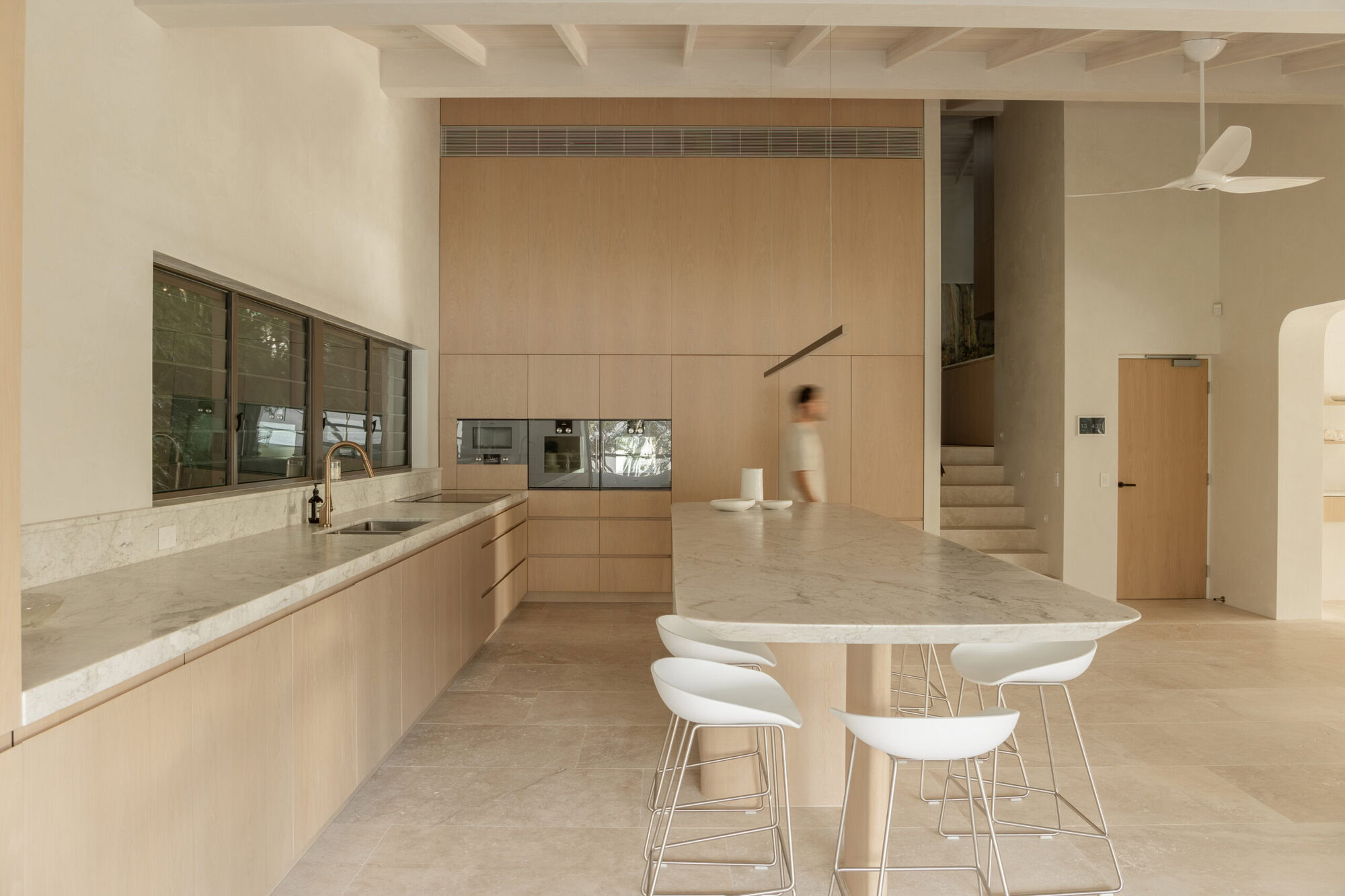
The homepage opens on a finished space, not a slab yard, with the line “Sourced at Origin. Curated for Design.” Directly beneath it sits a trade trust bar: CloutBuild, St Andrews Constructions, JDZ, Blackhaus Construction.
An architect knows what that row of logos means in under two seconds. That is the fastest credibility transfer on the entire site.
A product library, not a swatch grid
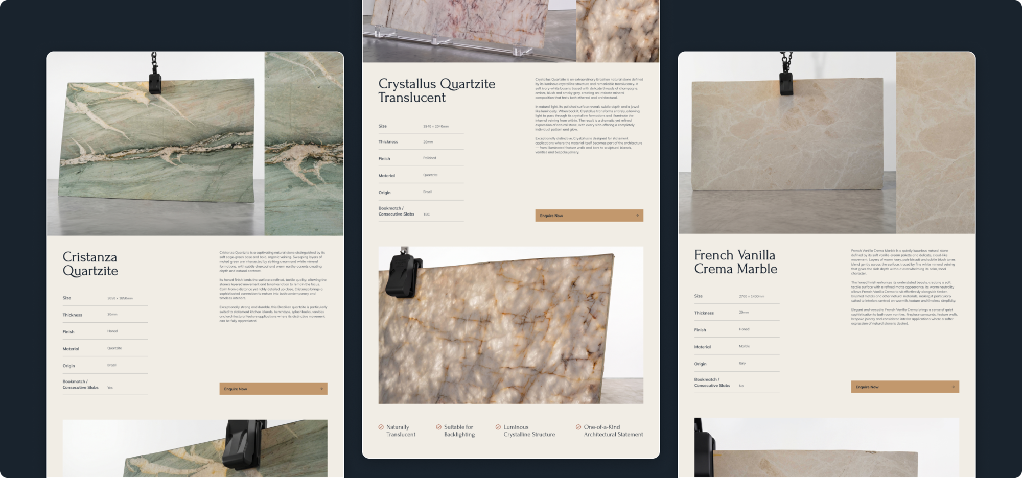
Every stone gets its own page and is named properly: Mattarazzo Dolomite, French Vanilla Crema Marble, Cristanza Quartzite, Bronza Marble, Blue Navaggio Quartzite, Crystallus Quartzite Translucent. Each is photographed as a full slab, so specifiers can read the movement across the piece rather than guess from a 200mm sample.
A process that
removes the fear
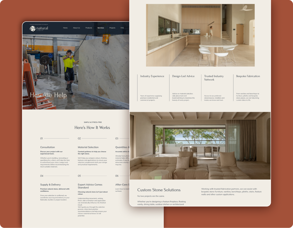
The Services page lays out six steps, from consultation through material selection, quantities and specification, supply and delivery, expert advice, and after-care support.
Homeowners do not hesitate because they doubt the stone. They hesitate because they do not know what happens next. Showing the process is a conversion fix, not a content exercise.
Four fixes
you can steal for your own site
Nothing changed about the stone. Nothing changed about the market. The only thing that changed was how we engineered the path from attention to purchase.
Four builder logos under the hero did more work than any paragraph about quality could have.
a lane.
One site can serve architects, builders and homeowners. It cannot serve them with the same page.
the product.
When a purchase feels risky, showing what happens next is the fix.
per page.
Every extra ask costs you enquiries.
We will audit your website free and show you at least three high-impact fixes. If we cannot find three, we will pay you $100.
Michael Donovan
Founders, Growthify