
Built to be Recognised
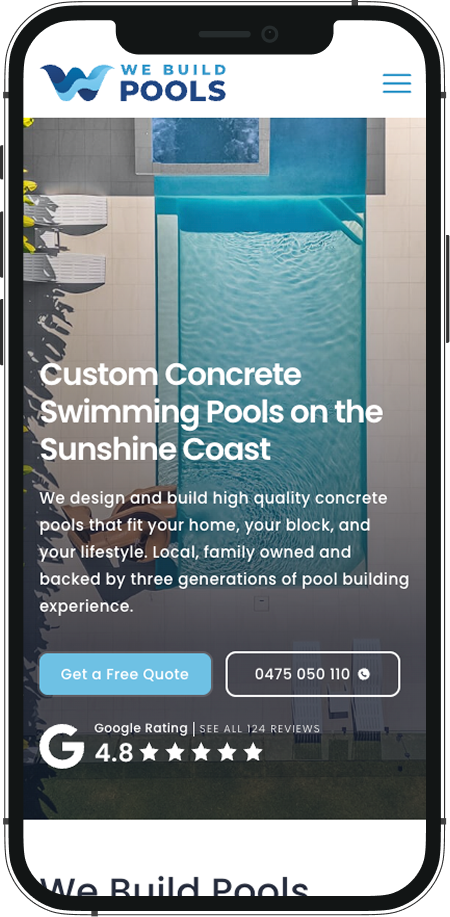
Logos, brand systems, and print ready files for signage, vehicles, and workwear. Designed for businesses that intent to be the obvious choice.










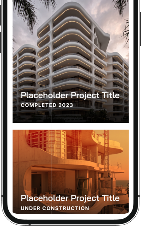
The mark
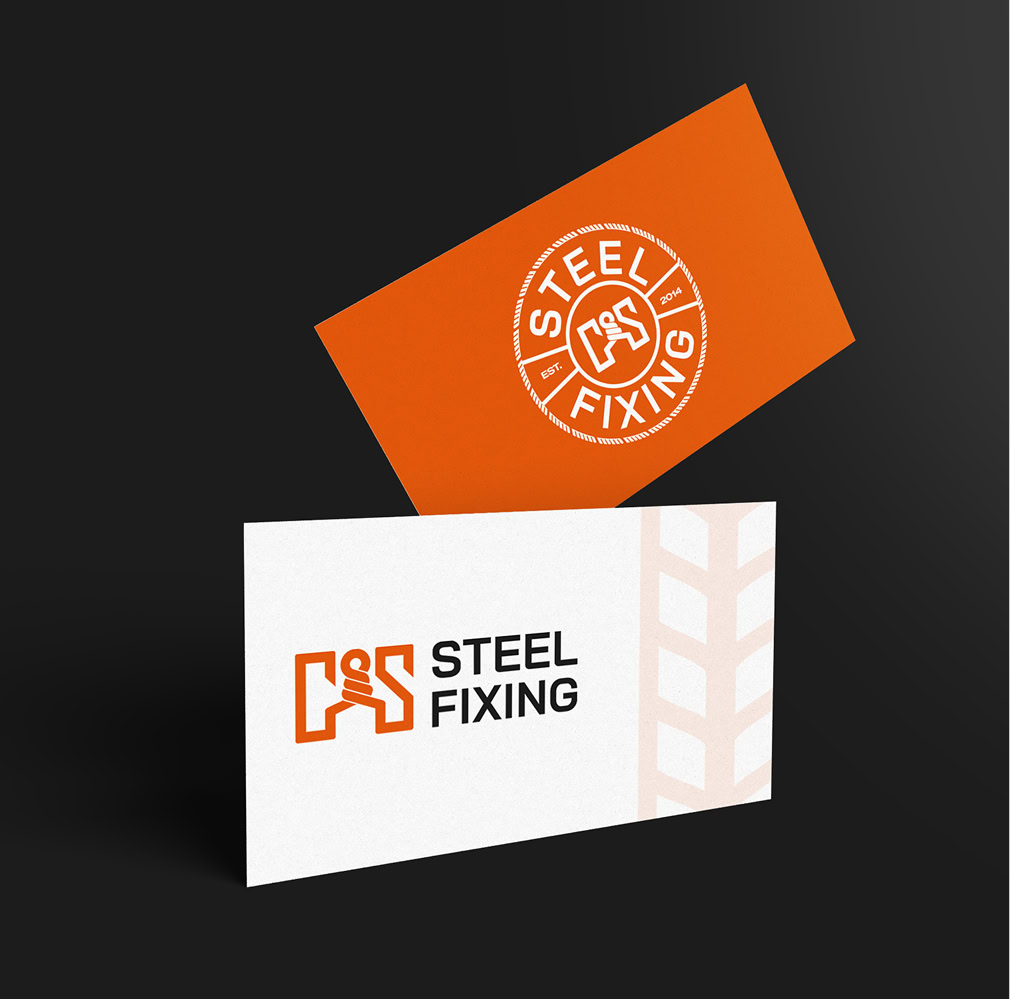
Primary, secondary, stacked, mono, and icon. Drawn to hold its shape on a business card and on a 6 metre banner.
The system
Colour, type, spacing and tone, documented. One reference that keeps every printer, signwriter, and designer on the same page.
In the wild
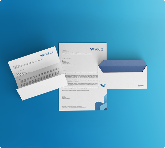
Vehicles, signage, workwear, stationery, and social. Where the brand stops being a file and starts being an impression.
Brands We Have Built
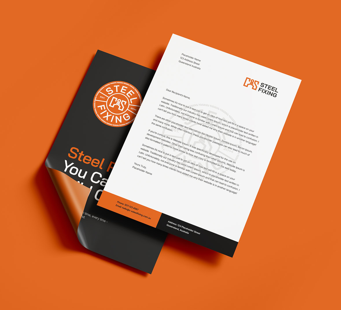
Everything runs on one idea. A crew that looks organised looks safe, and a crew that looks safe gets asked back.
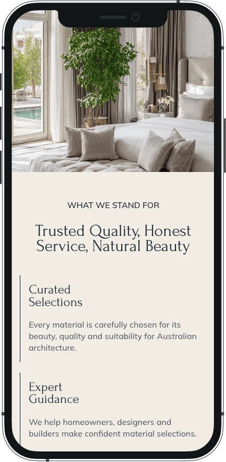
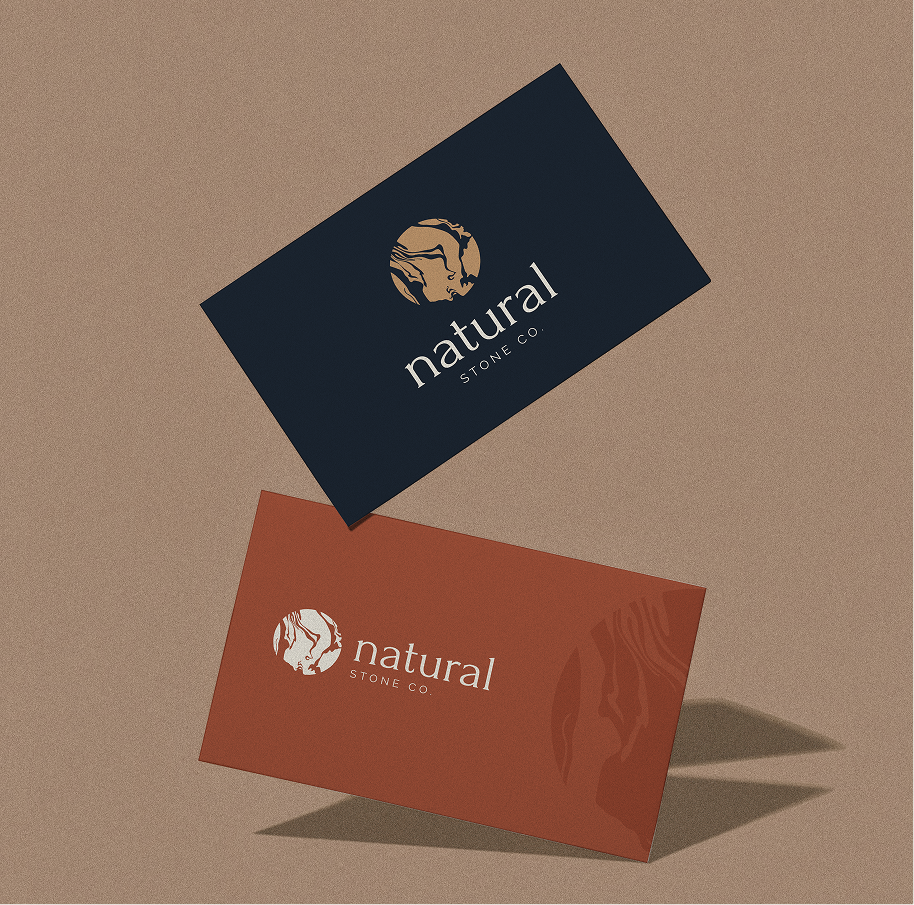
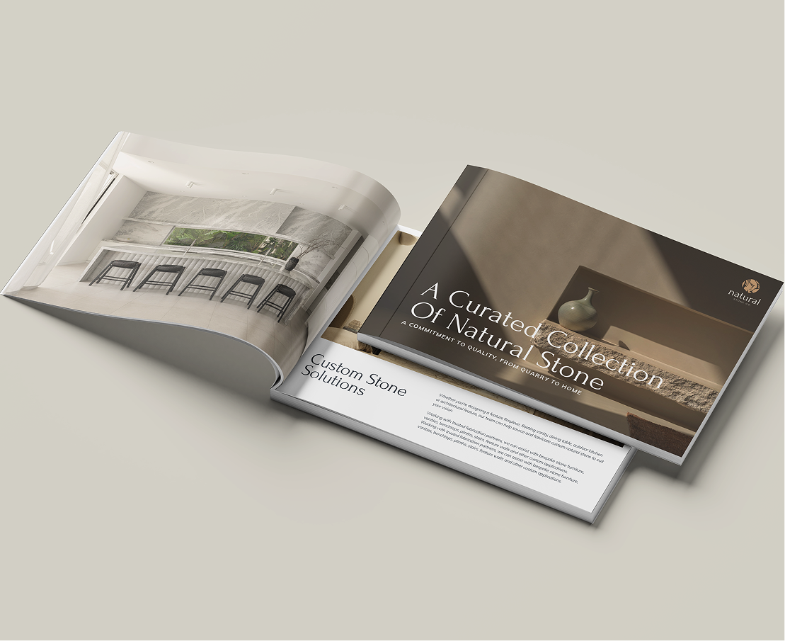
We built the identity out of the material itself. The mark is marble veining. The palette is taken from quarried stone. The headline typeface is the kind of serif once carved into it. The result looks expensive because it looks like the product, not because it claims anything.
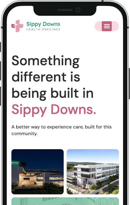
That is a positioning decision as much as a design one. A precinct that sends patients home by dinner is not competing with a large public hospital on scale. It competes on how the day feels, and the brand had to start making that promise in the car park.
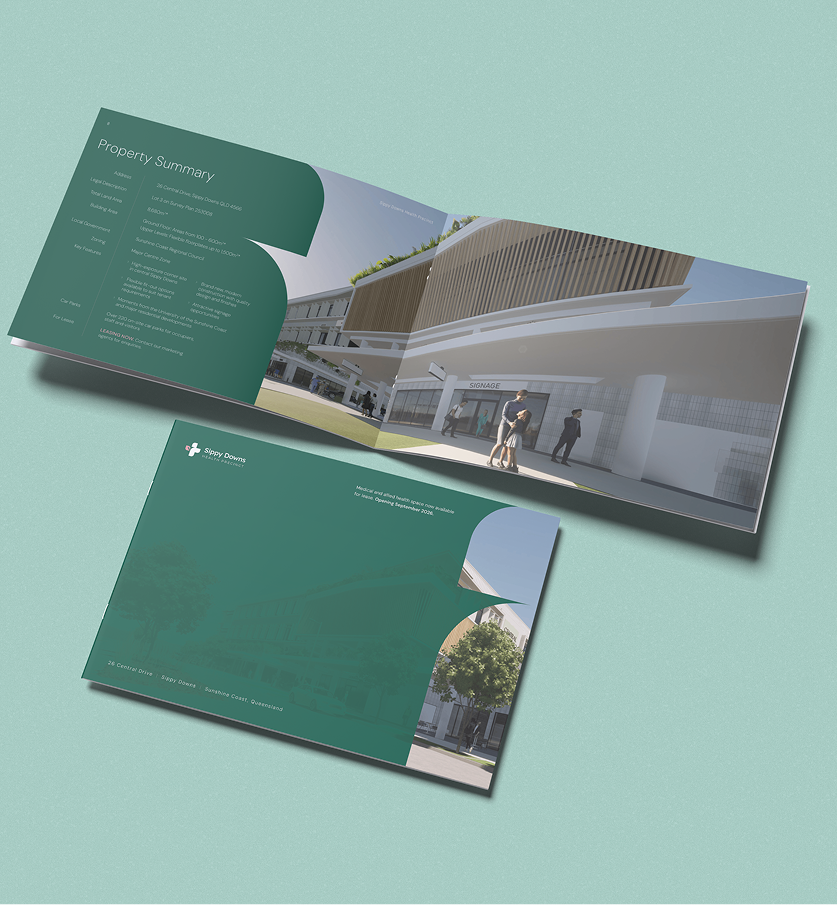
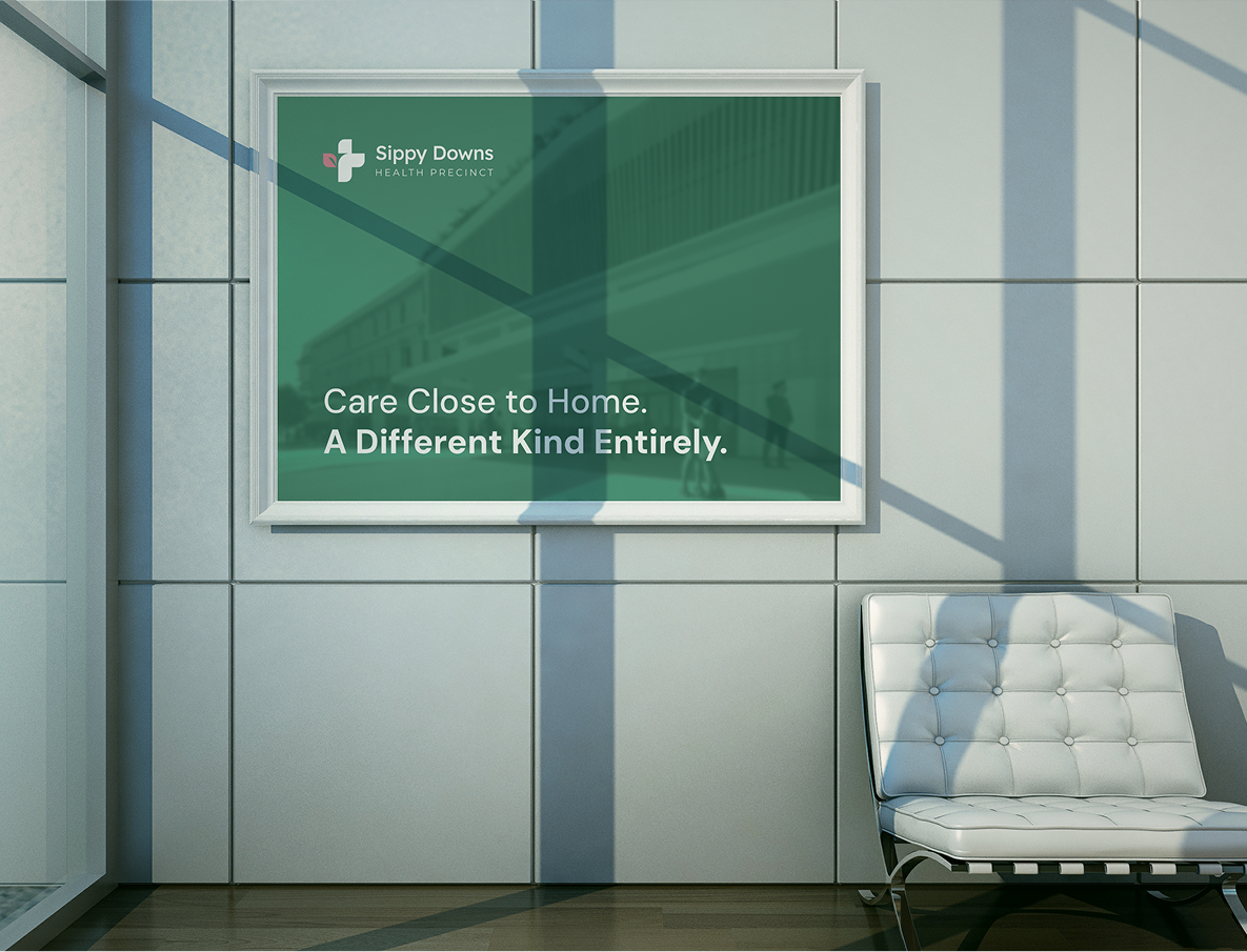
So we aimed the identity at the gap. Every decision in the system signals preparation and steadiness, on the reasoning that a business that looks organised from the outside is far easier to believe on the inside.
How it is made
Discover
Who you sell to, who you are against, what the brand has to do.
Direction
One or two considered concepts. Not fifteen for you to referee.
Build
The chosen route, refined, then extended into a full system.
Handover
Every file, the guide, and a walkthrough so you can use it for years.

What You Have
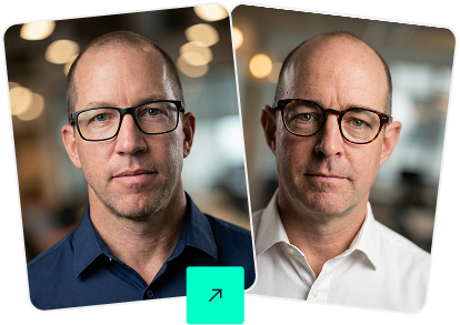
Michael Donovan
Founders, Growthify