Nobody buying a pool is choosing a pool. They are choosing who they will trust in their backyard for the next two months.
The category makes that choice hard. Line up ten builders and you get ten versions of the same photograph, which leaves a homeowner nothing to weigh up except the number at the bottom of the quote. Looking identical is expensive.
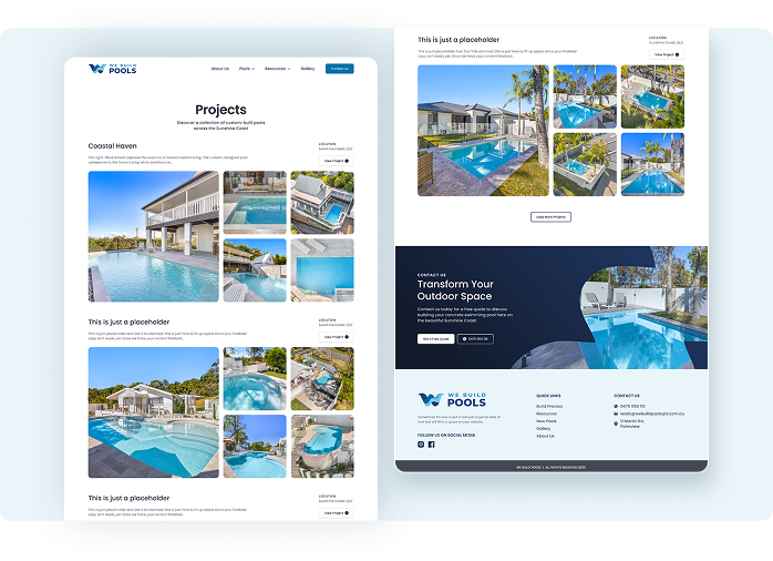
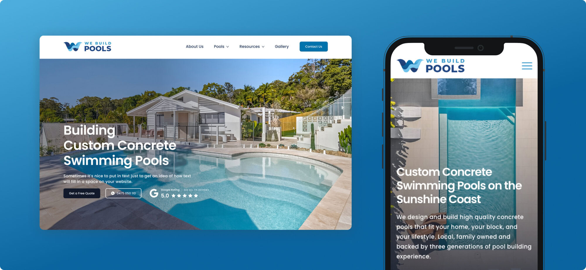
So we aimed the identity at the gap. Every decision in the system signals preparation and steadiness, on the reasoning that a business that looks organised from the outside is far easier to believe on the inside.

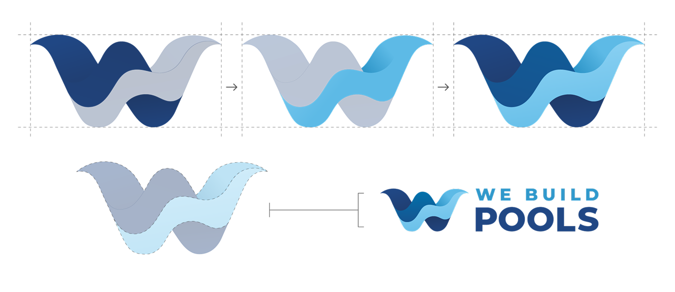
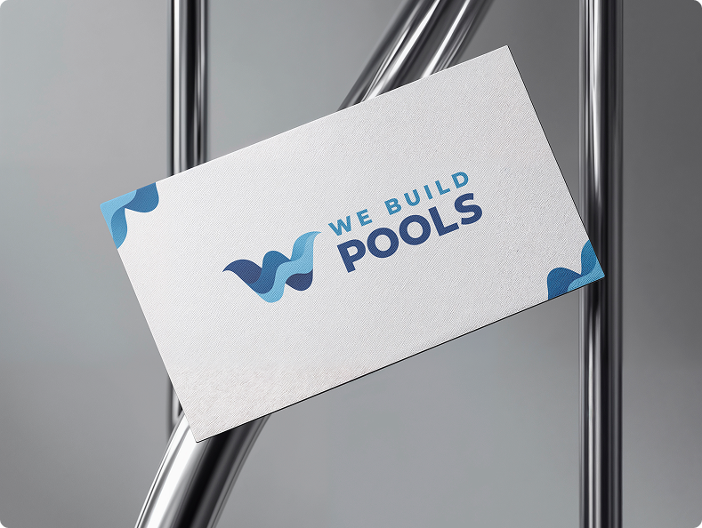
Drawn from water in motion, the mark is a W formed from two overlapping wave shapes, layered in the brand blues so the eye reads depth before it reads a letter. The pool and the name in one form, which is what lets it work later as a mark on its own.
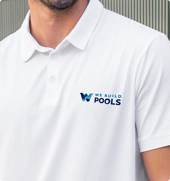
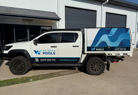
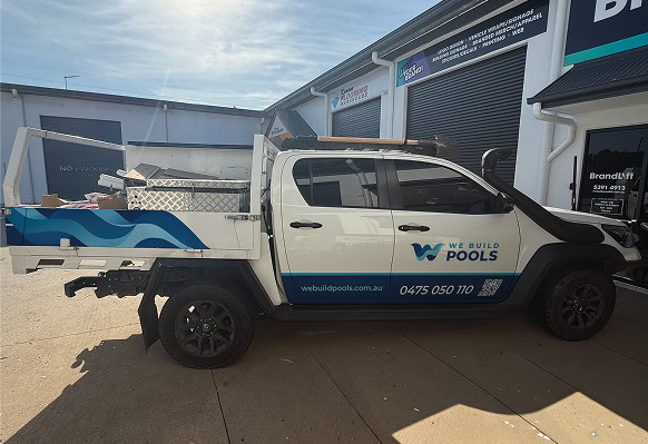
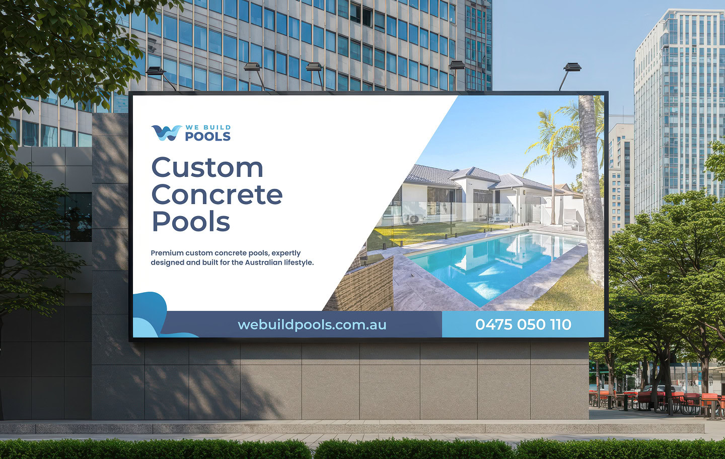
The horizontal lockup leads for practical reasons rather than aesthetic ones. This brand works hardest on a site fence read at 40 kilometres an hour, on a truck door in full sun, and stitched into a shirt. It had to be legible first and interesting second. The logomark then covers everything the wordmark cannot survive, from favicons to embroidery, and tinted back it becomes the watermark inside the pattern.
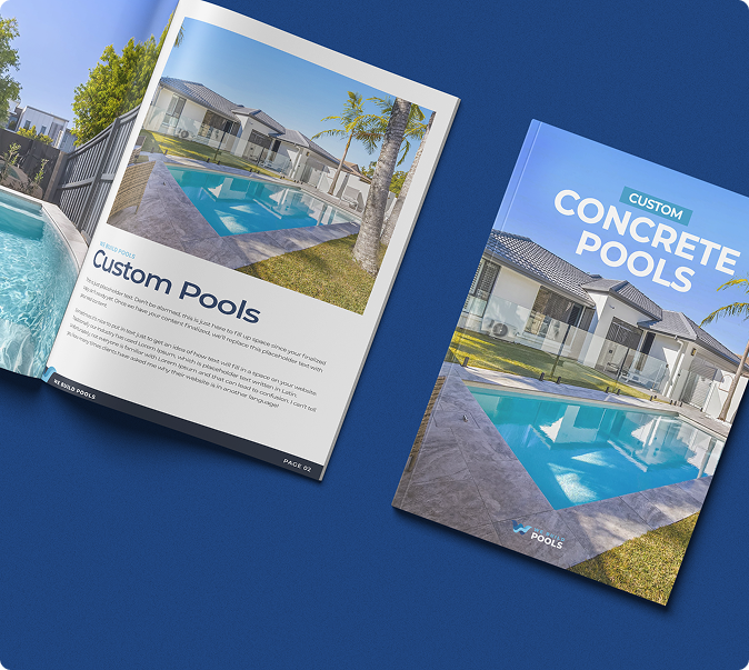
In print, Montserrat carries the headlines. It keeps its shape when a signwriter cuts it into vinyl, and it still reads from across the street.
On the web, Poppins runs everything, headlines and body copy. Nice and clear at the size everyone actually reads on through the phone.
Two typefaces, two clear jobs. That is usually all a business this size needs, and it is what stops a brand looking different in every document.
SUBHEADLINE GOES HERE
This is just a placeholder headline
This is just placeholder text. Don’t be alarmed, this is just here to fill up space since your finalized copy isn’t ready yet. Once we have your content finalized, we’ll replace this placeholder text with your real content.
Water gets darker the deeper it goes, so we let depth set the hierarchy.
The navies carry anything that makes a promise, because depth reads as substance. The mid blues lift the system and stand in for clear water rather than corporate blue. Underneath sits the layer most brands never get given: a defined set of greys for text, dividers and backgrounds.
Palettes rarely fall apart because the brand colours were wrong. They fall apart because nobody decided what colour the body copy is.
Four gradients finish it, named for what they describe: Midnight Horizon, Deep Ocean, Coastal Breeze, Crystal Wave. Depth on the big surfaces, nowhere near small type.
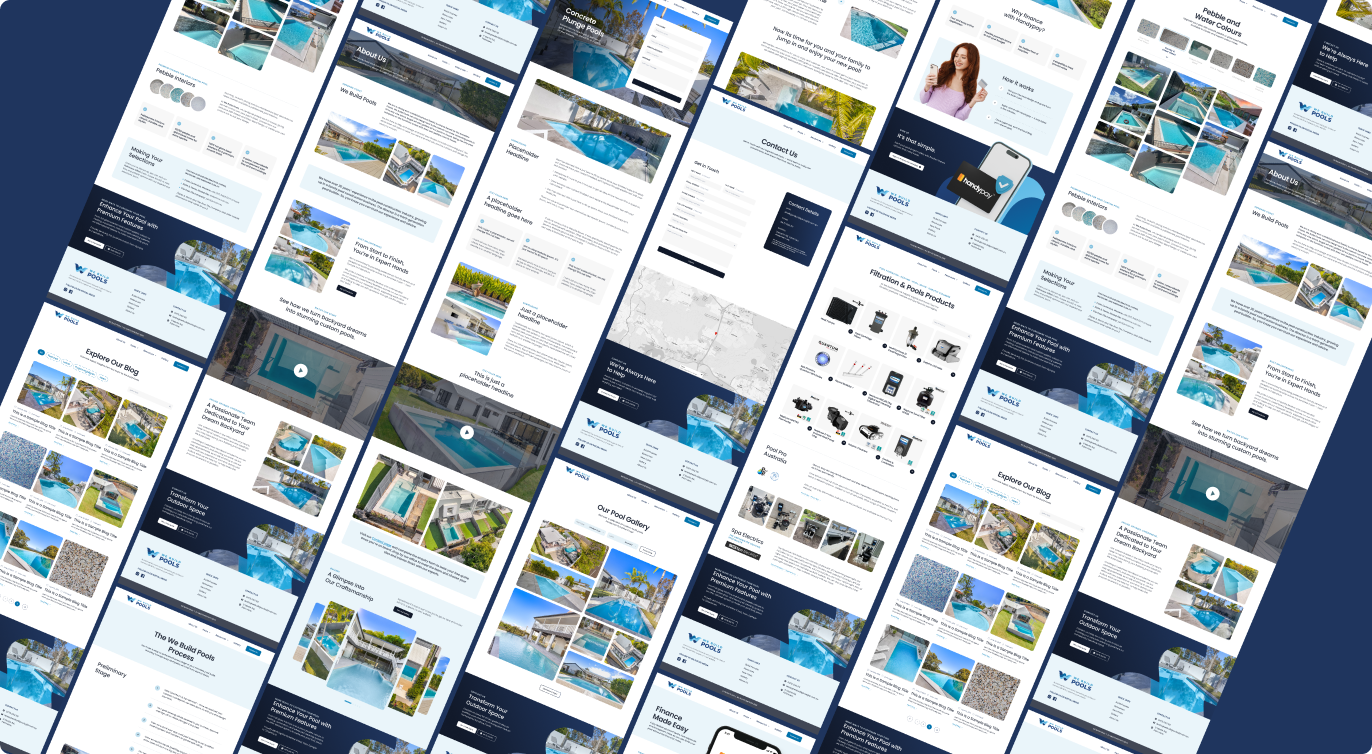
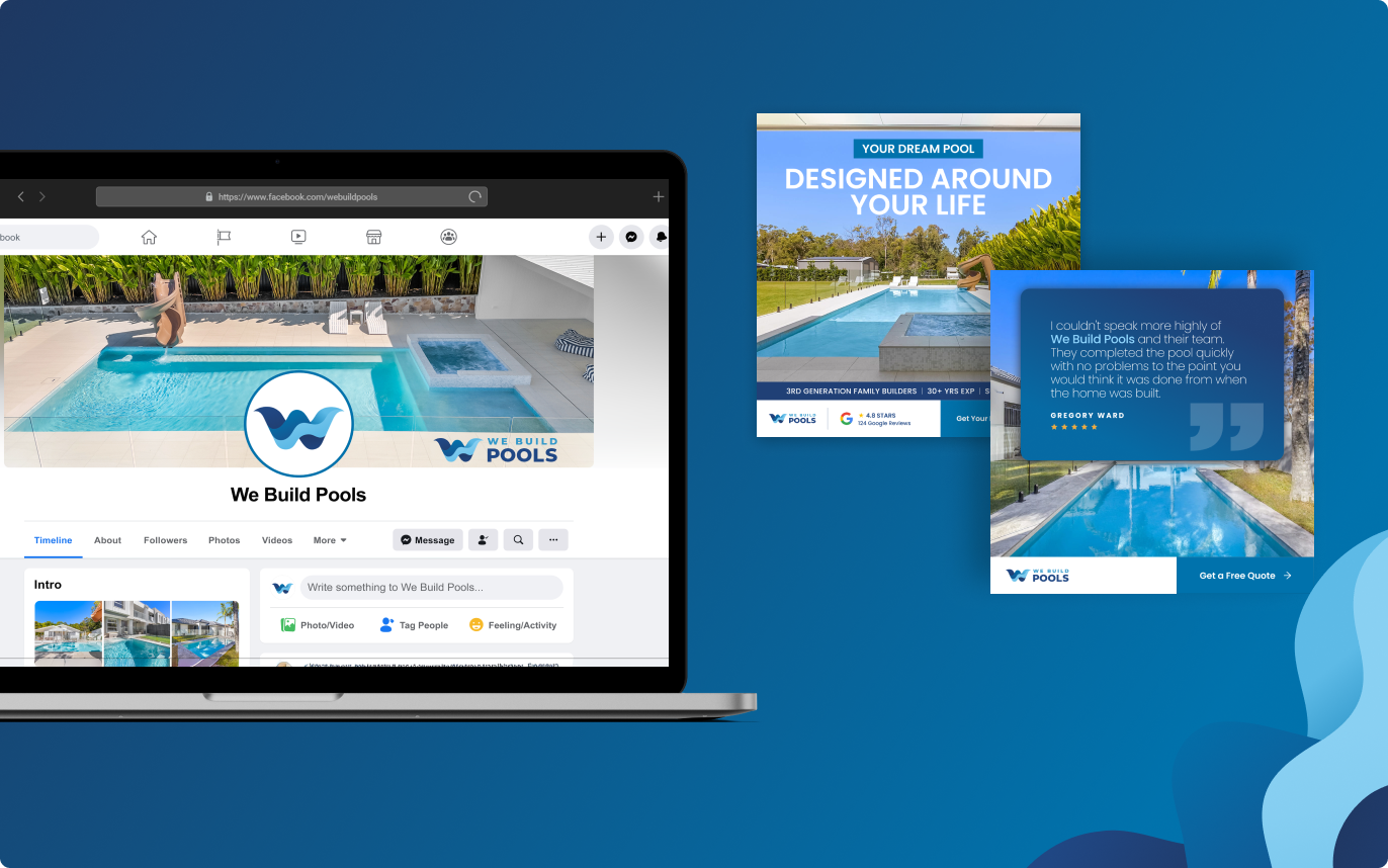
A logo, two typefaces and a palette still leave you with empty space to fill on covers, panels and backgrounds. Rather than reaching for a flat block of colour, the system has its own texture.
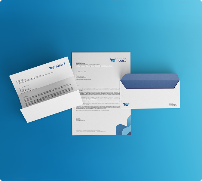
It is pulled from the same reference as the mark, ripples and lane markings, flattened until it behaves like a surface instead of a picture. One strand in tight spaces, tiled across larger ones, with a faint watermark of the mark where that helps.



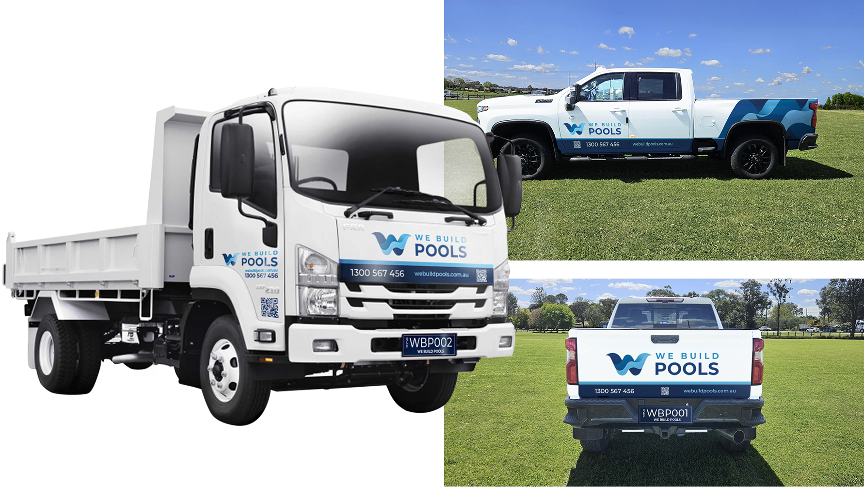
This is just placeholder text. Don’t be alarmed, this is just here to fill up space since your finalized copy isn’t ready yet. Once we have your content finalized, we’ll replace this placeholder text with your real content.
Bring us your logo, your signage, and your site. We will tell you what is working, what is not, and what we would fix first.