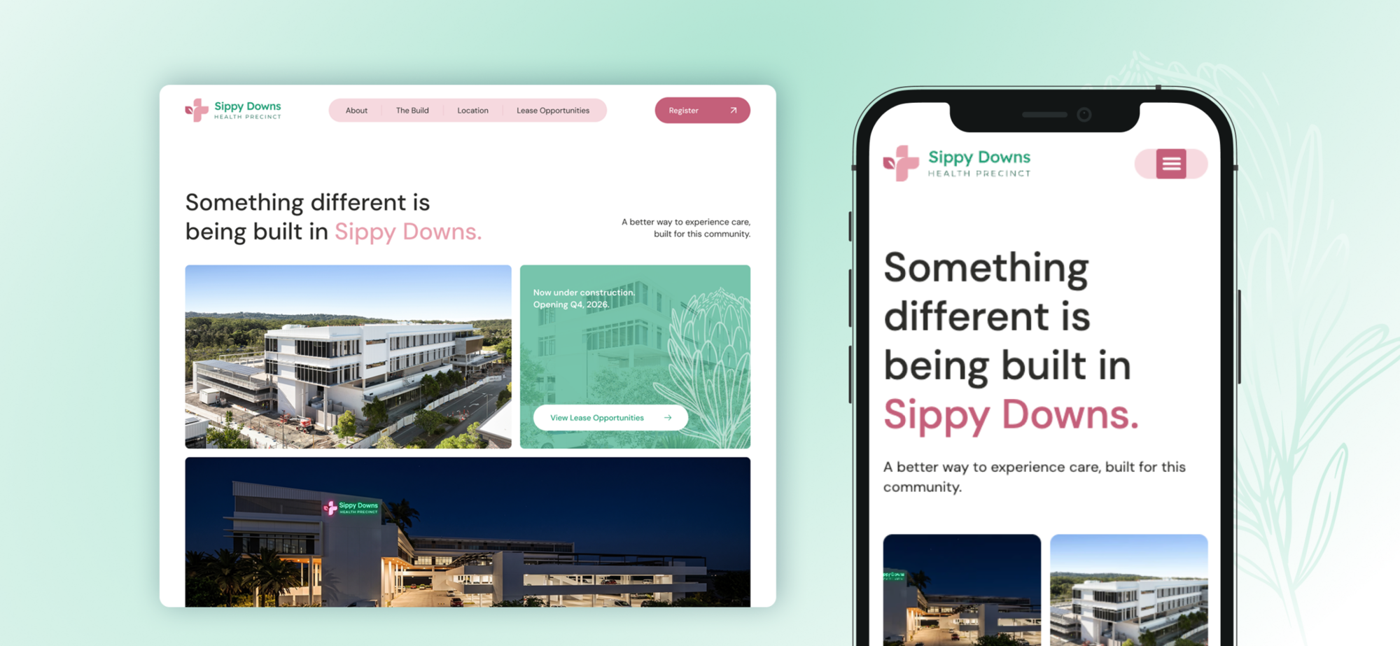
Most hospitals feel the same before you even walk in. Fluorescent light, antiseptic smell, and the institutional blue that has somehow become shorthand for clinical care.
We started from a different question. What if a hospital felt like the Sunshine Coast? What if the colours came from the wallum heathland native to the area rather than a corporate palette, and warmth was treated as a clinical value instead of a soft extra layered over the medicine?
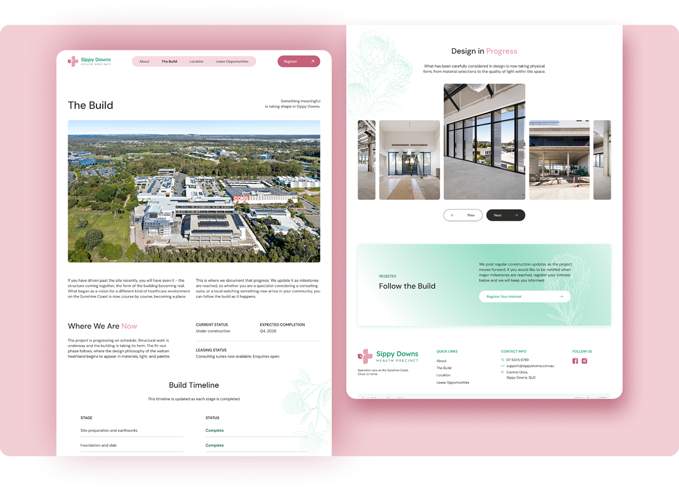
That is a positioning decision as much as a design one. A precinct that sends patients home by dinner is not competing with a large public hospital on scale. It competes on how the day feels, and the brand had to start making that promise in the car park.
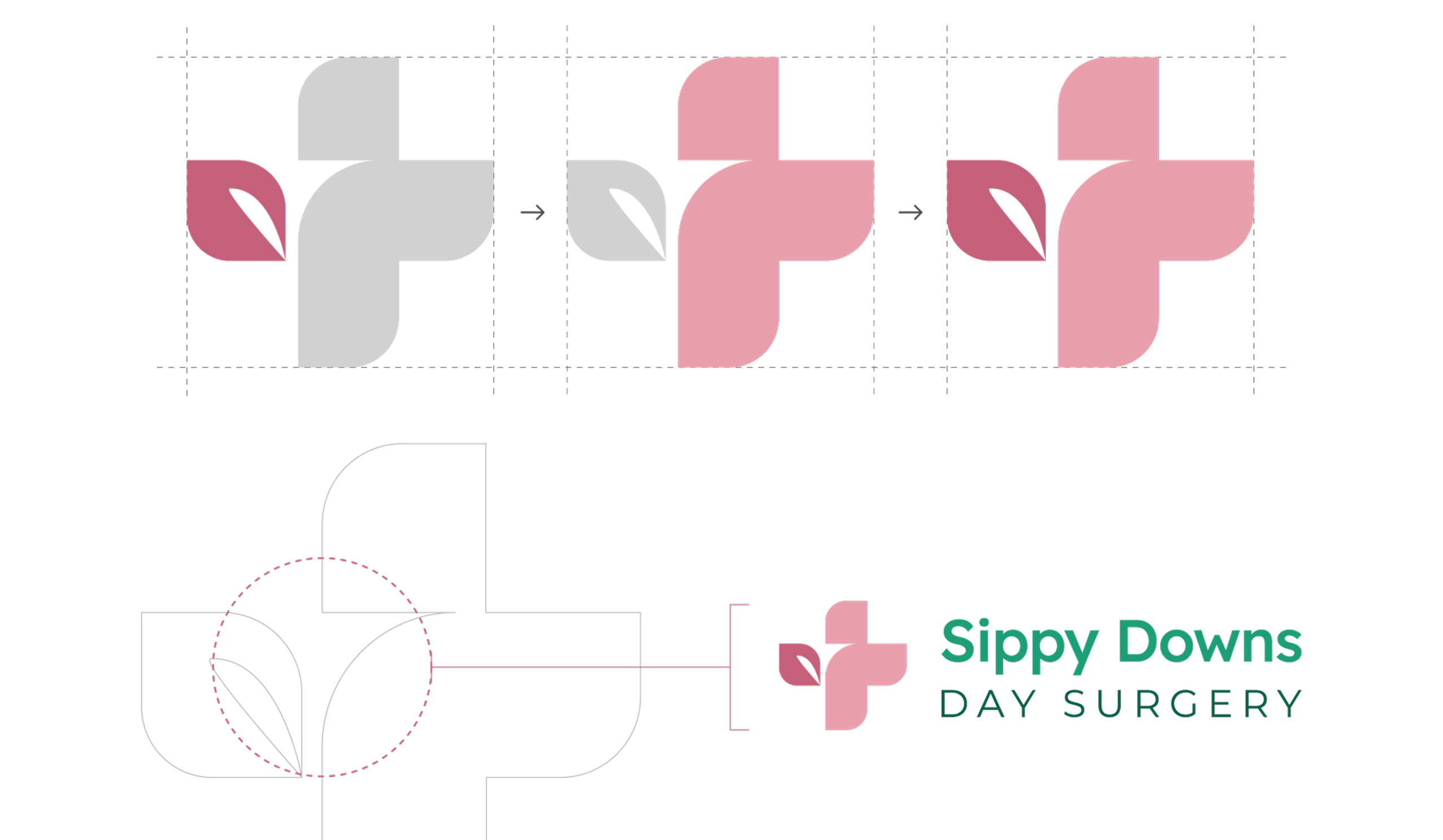
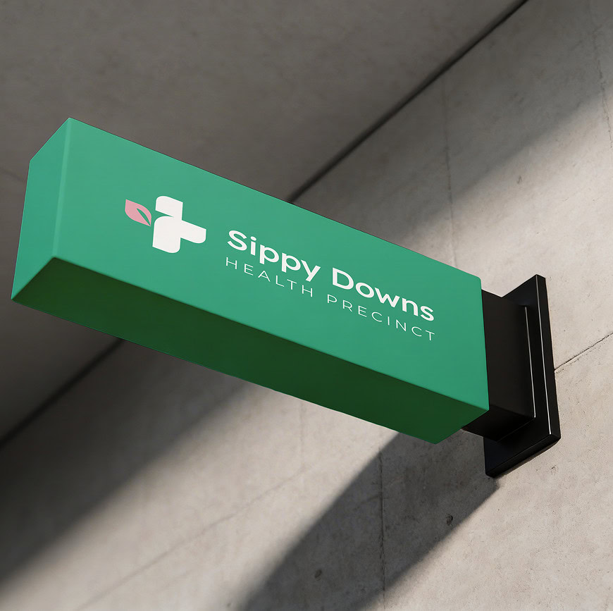
The cross stays, because this is still a hospital and that shorthand earns trust immediately. But it is built from two soft rounded forms rather than hard right angles, with the institutional edge deliberately taken off. Inside the left half sits a single leaf, a quiet nod to the wallum heathland this precinct grew out of.
Cross and leaf. Care and Country, held together in one shape.
The wordmark is set in DM Sans. Sippy Downs leads in a confident weight, rooting the brand in the specific place it belongs to, with Health Precinct beneath in tracked capitals. Steady, understated, matter of fact. The name does not shout, and it does not need to.
Horizontal for most applications, stacked for compact and vertical spaces, both in full colour, mono and reversed. Clear space is measured off the leaf.
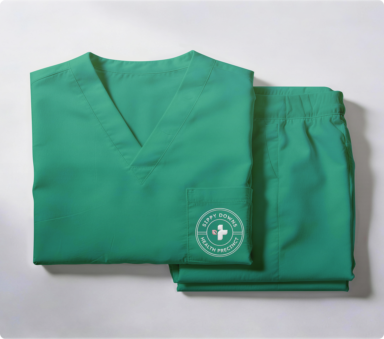
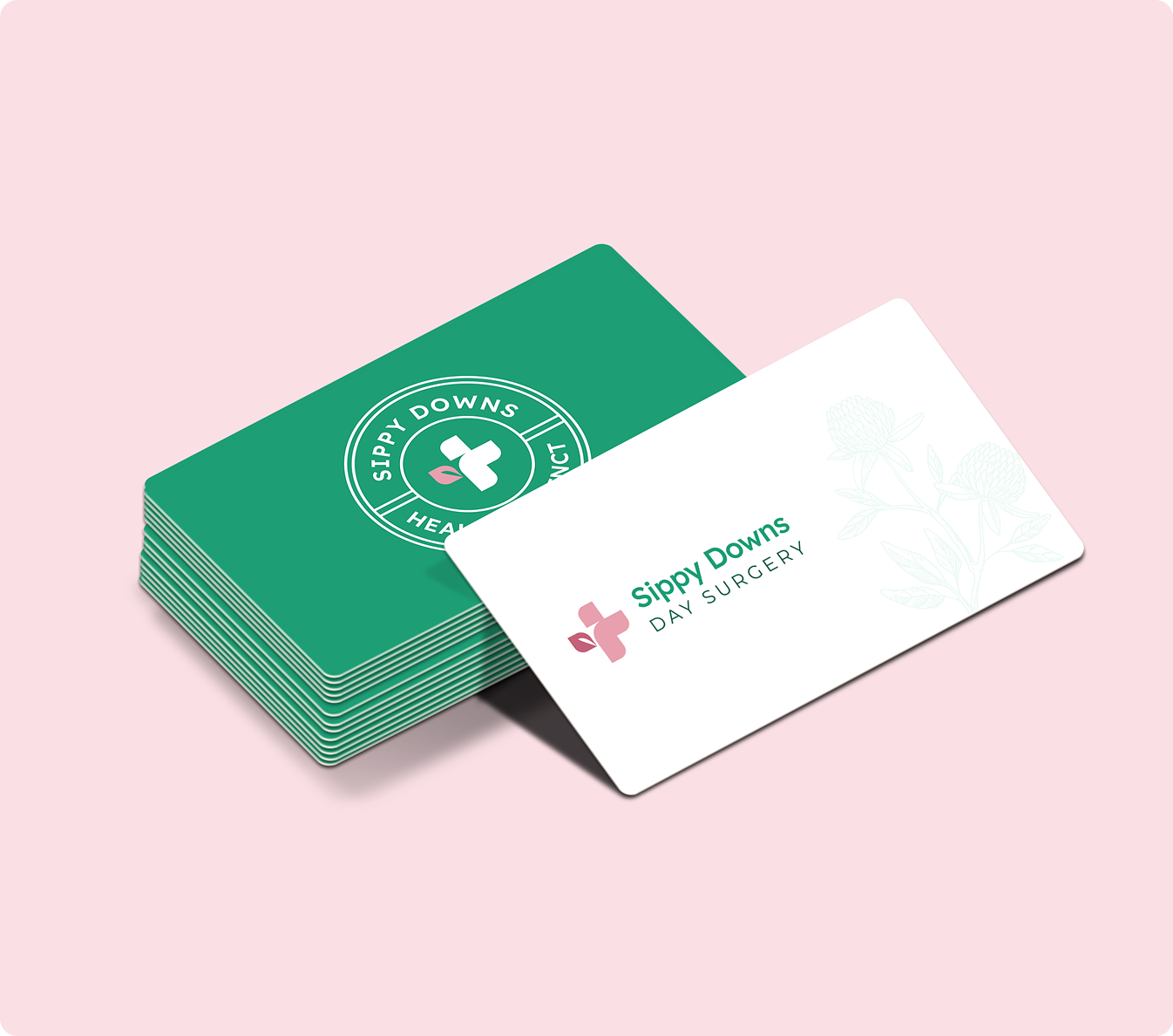
DM Sans does all of it. Quiet, modern, and legible at every scale, which counts for more here than in most categories. This brand has to work on wayfinding read by someone anxious and in a hurry, and on a consent form read by someone who is not.
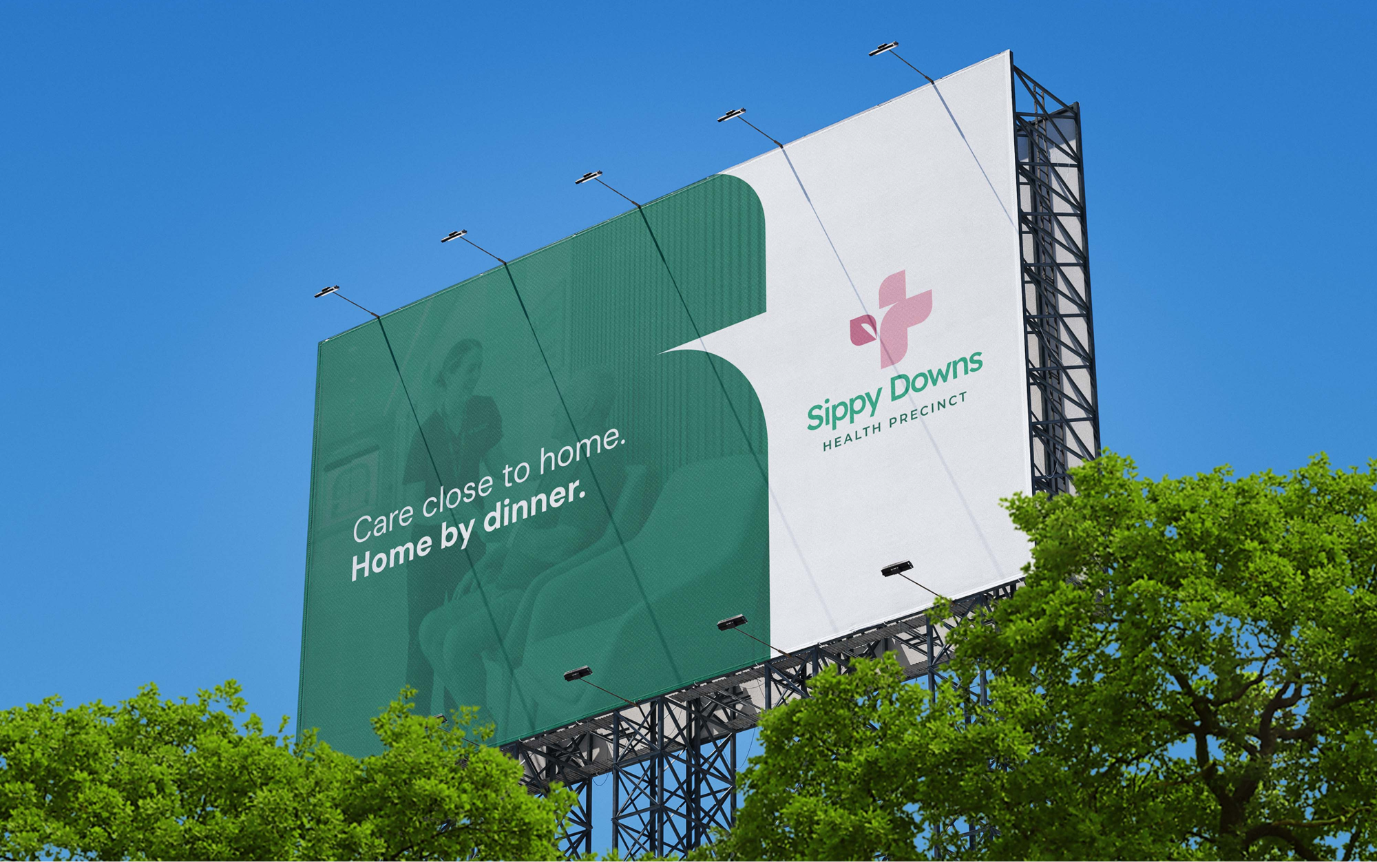
Hierarchy comes from weight and spacing rather than a second family. Fewer moving parts, less to get wrong, and one voice across everything from a billboard to a discharge letter.
This is just a placeholder headline here
Sometimes it’s nice to put in text just to get an idea of how text will fill in a space on your website.
This is just placeholder text. Don’t be alarmed, this is just here to fill up space since your finalized copy isn’t ready yet. Once we have your content finalized, we’ll replace this placeholder text with your real content.
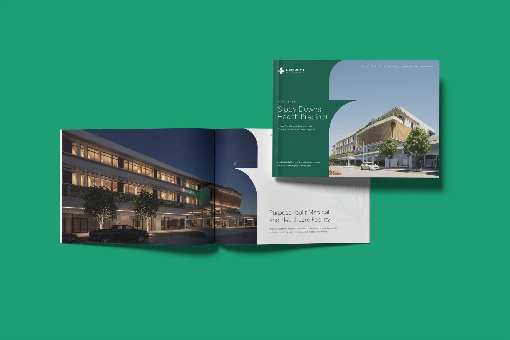
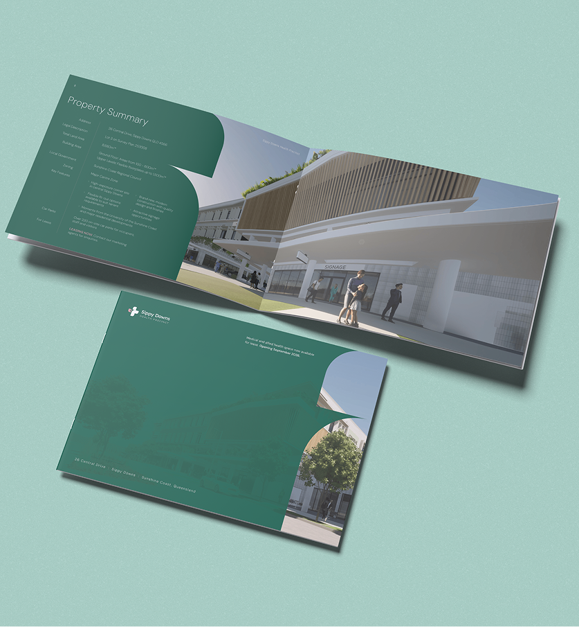
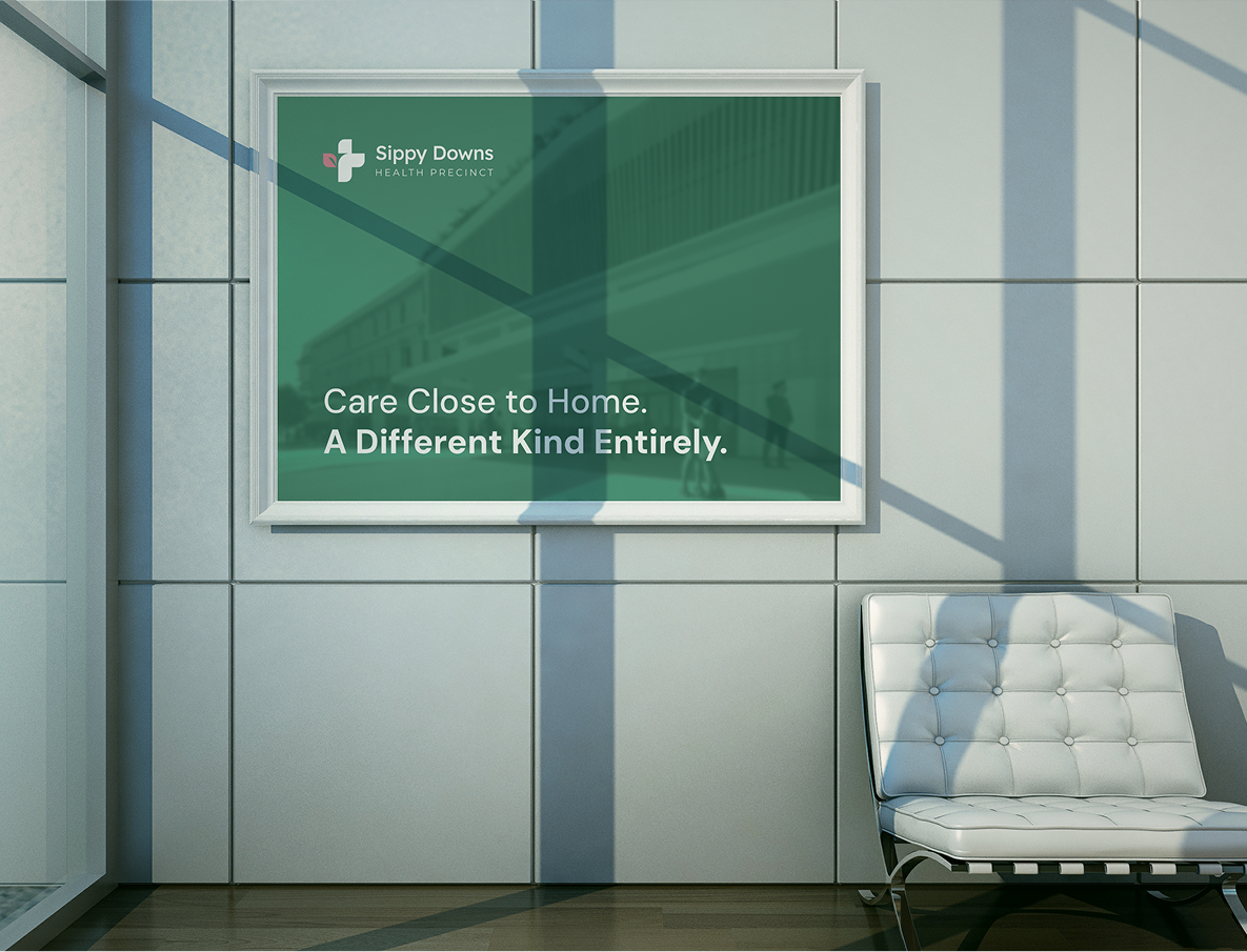
The greens are the backbone. Deep Canopy, Hinterland and Coral Sea, drawn from the dense hinterland that frames the coast, running through primary, secondary and tertiary use to carry trust and clinical confidence.
The pinks bring the warmth. Boronia, named for the Wallum Boronia that flowers across the coastal heath, with Rosma as the softer accent and Petal as a background. Green and pink sitting beside each other the way they do in the landscape outside.
Then Night Sky and white for body copy, legal text and fine print. That is the layer that keeps a palette this warm still reading as a medical institution.
Not a drop of institutional blue anywhere in it.
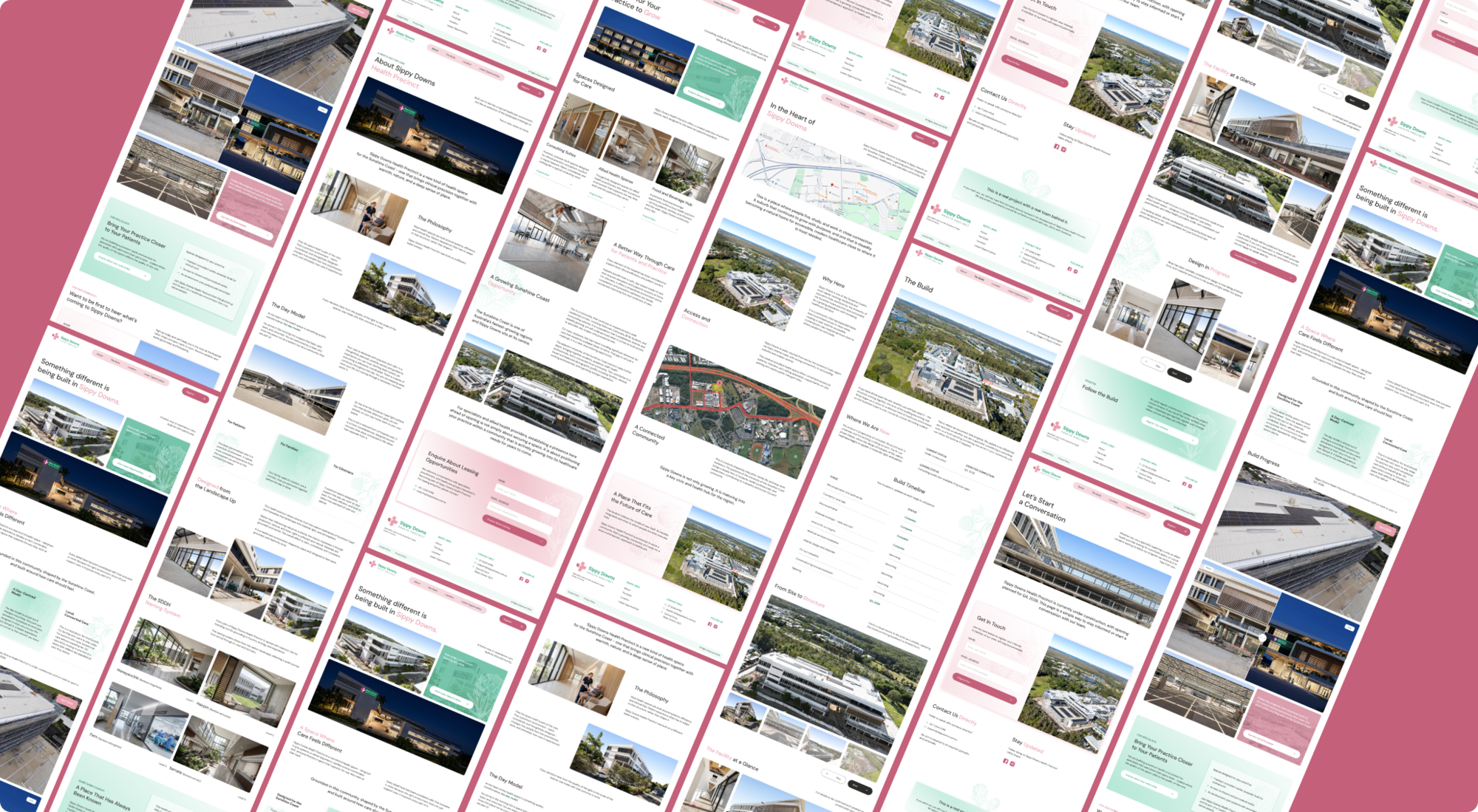
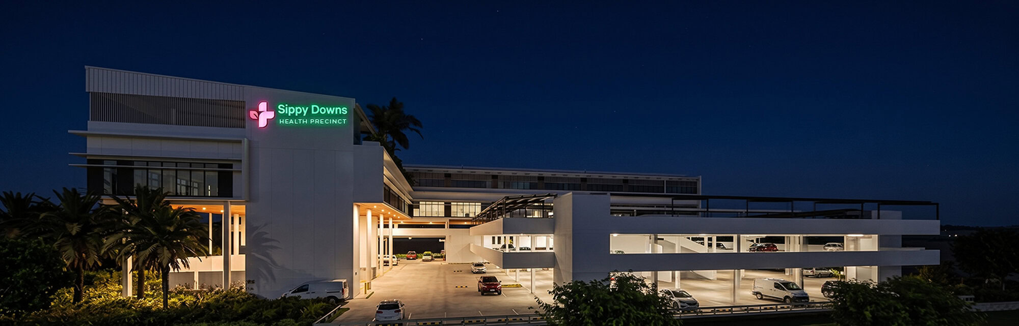
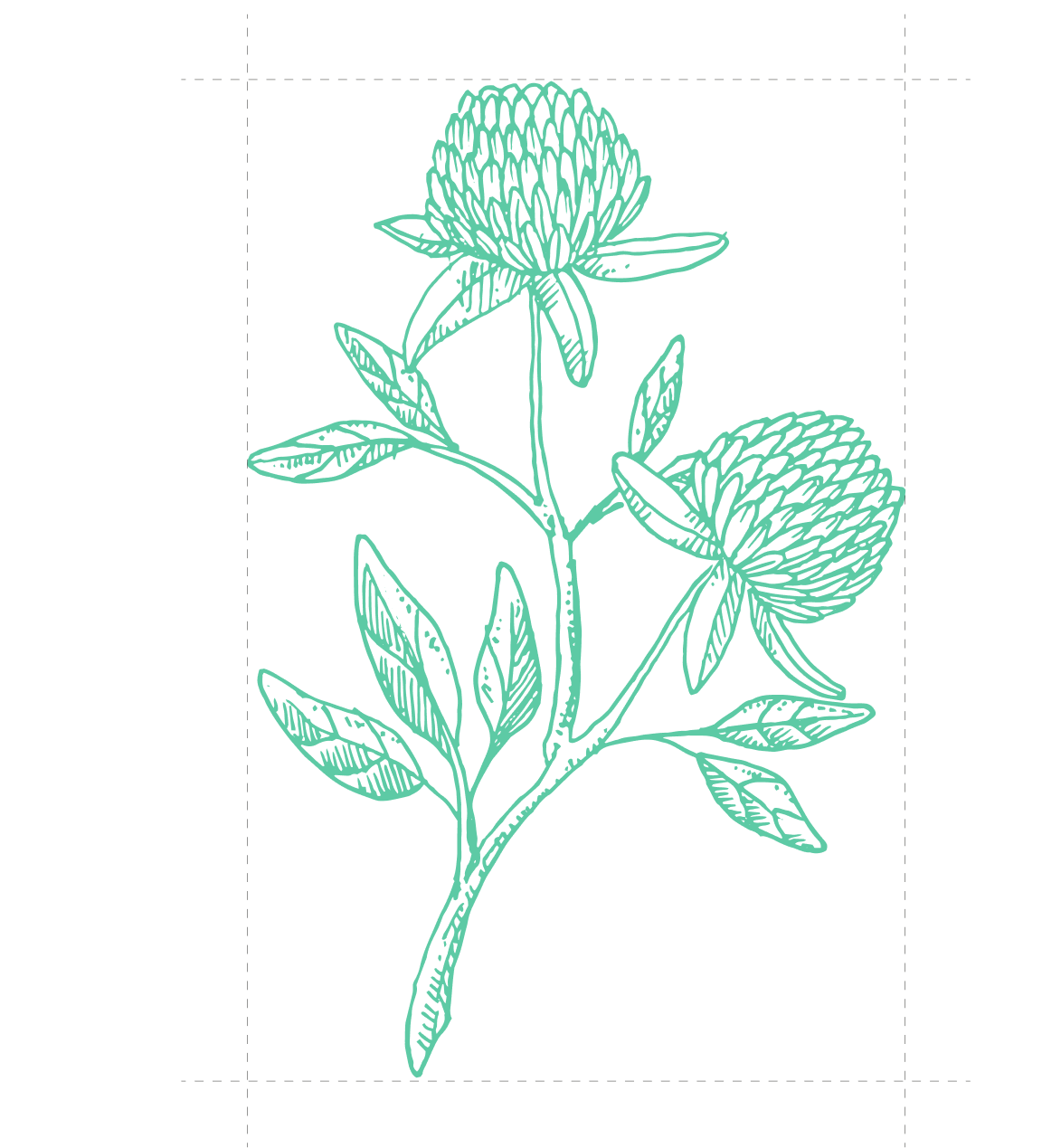
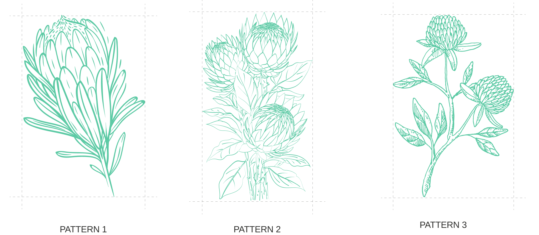
The patterns are a set of three stencil-style illustrations drawn from the native Banksia flower, rooted in the natural character of the Sunshine Coast.
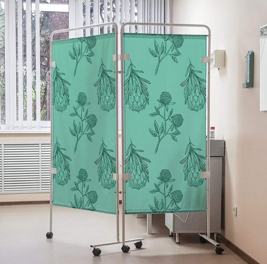
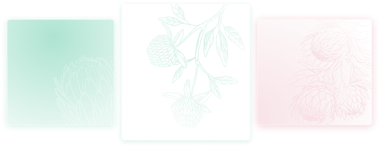
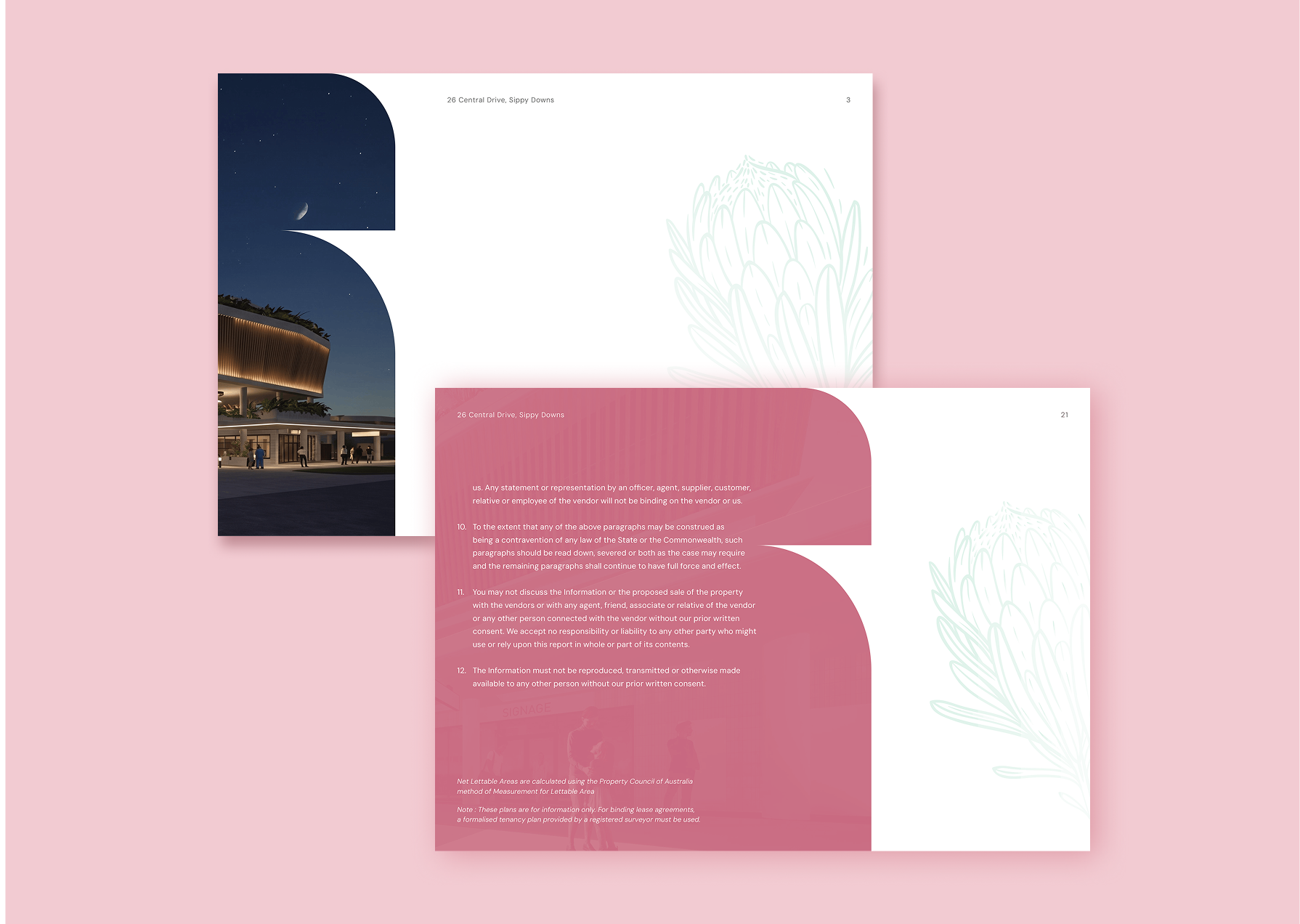
They are used sparingly and at low opacity, usually in soft gradients, sitting behind content to add texture and depth without pulling attention off anything that matters. Having three rather than one means a set of materials can feel related without repeating itself.
What they really add is local identity. A green stencil field on a scrub pocket, a pink one behind a waiting room message, the same flower again on a billboard. It is the quietest part of the system, and the part that does most to make the place feel like it belongs here.
This is just placeholder text. Don’t be alarmed, this is just here to fill up space since your finalized copy isn’t ready yet. Once we have your content finalized, we’ll replace this placeholder text with your real content.
Bring us your logo, your signage, and your site. We will tell you what is working, what is not, and what we would fix first.