Stone suppliers all sell similar products from similar quarries. When nothing separates them visually, buyers decide on price, and the supplier with the best material loses to the one with the cheapest quote.
Natural Stone Co. sit at the premium end and had no intention of moving. So the brand needed to signal quality early, well before a price was discussed.
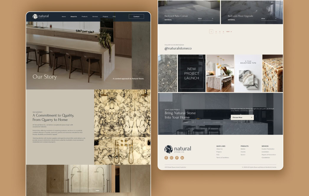
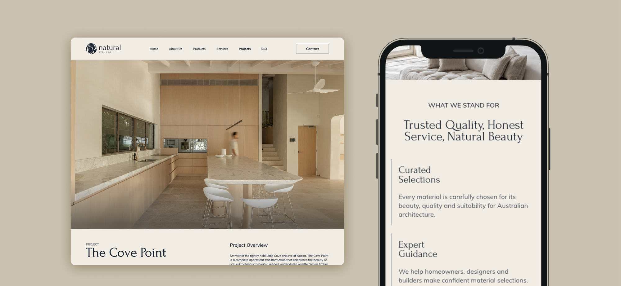
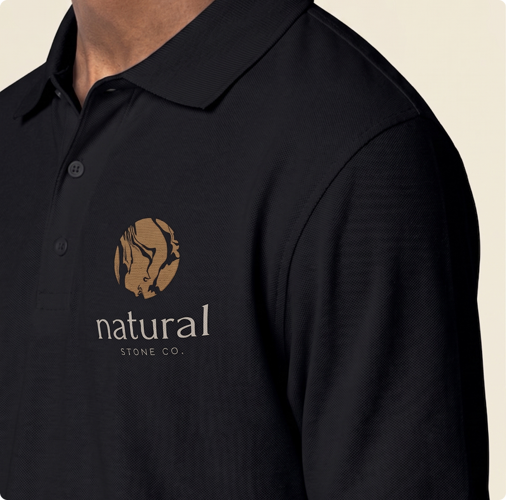
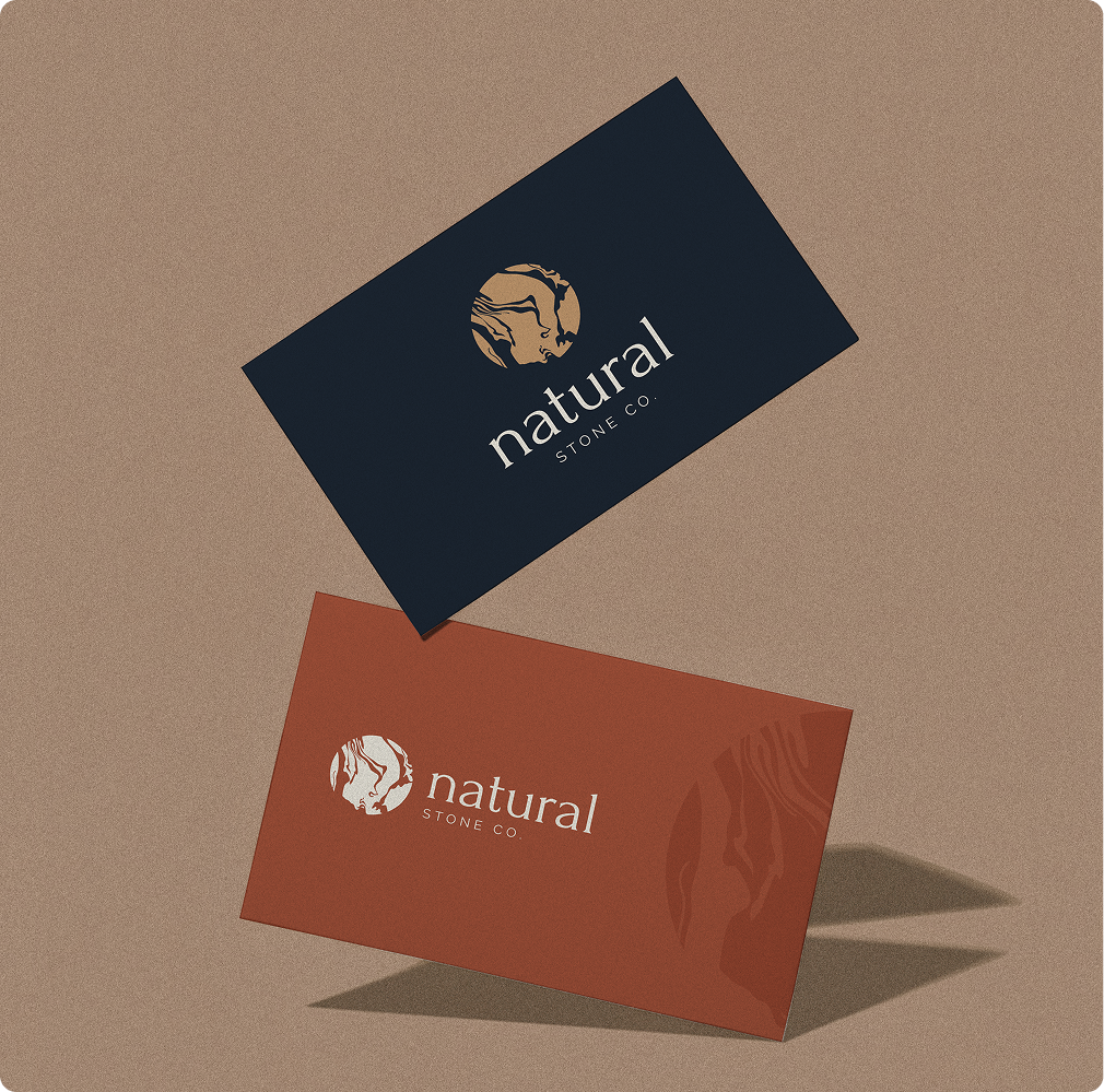
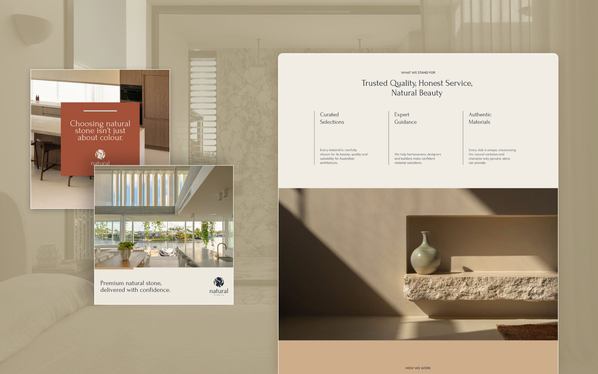
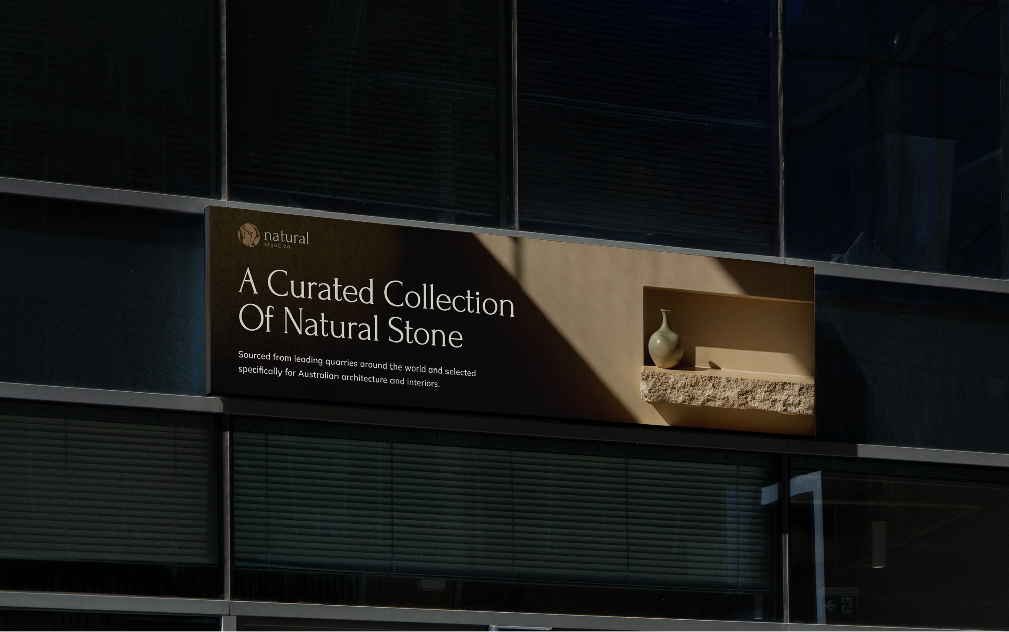
We built the identity out of the material itself. The mark is marble veining. The palette is taken from quarried stone. The headline typeface is the kind of serif once carved into it. The result looks expensive because it looks like the product, not because it claims anything.

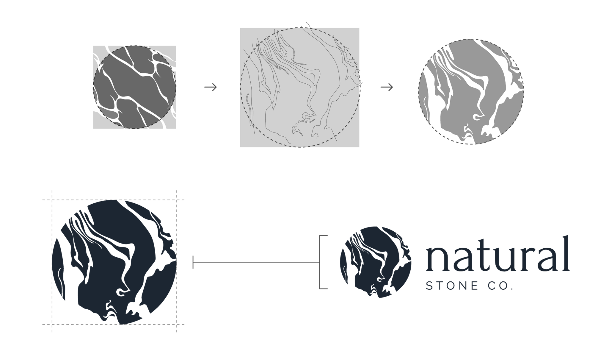
The mark is marble veining set inside a circle. It is the stone itself, standing in for the name.
Veining is the natural pattern running through marble, and no two pieces are ever the same. That is the whole reason people choose natural stone over a manufactured surface, so it made sense to put it at the centre of the identity.
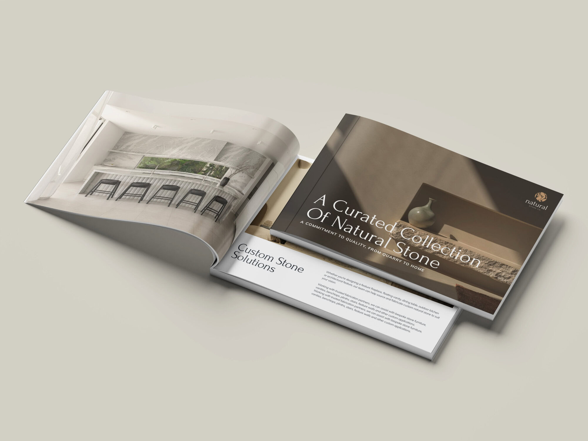
Forum takes the headings. It is a lapidary serif, the kind of letterform first cut into stone, and it looks expensive without any gloss.
Mulish does the body text and subheadings. Plain, and easy to read small, which is what spec lines and product detail need.
Raleway is the alternative for headings and subheadings, for when Forum is too much or the space is too tight.
PLACEHOLDER SUBHEADLINE
This is just a placeholder headline
This is just placeholder text. Don’t be alarmed, this is just here to fill up space since your finalized copy isn’t ready yet. Once we have your content finalized, we’ll replace this placeholder text with your real content.
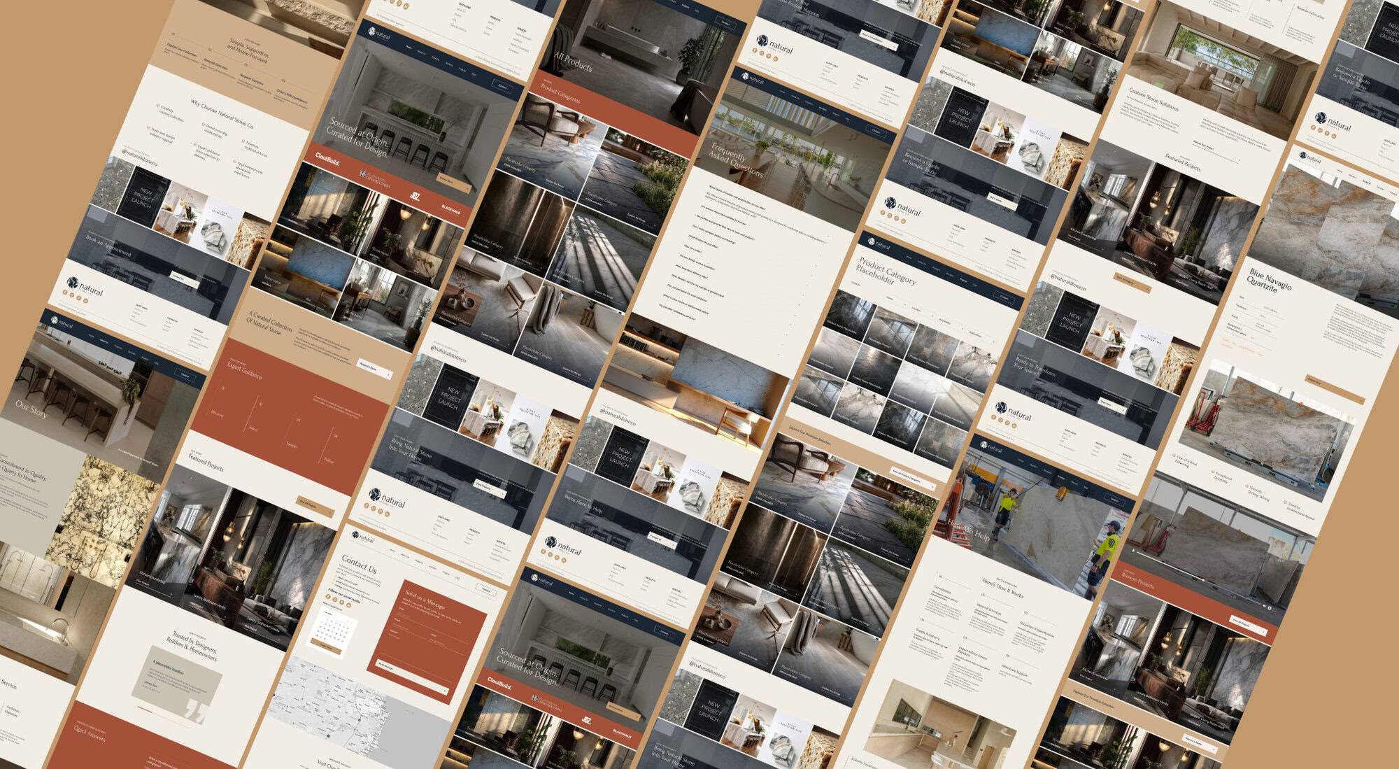
Ink navy for depth and authority. Terracotta for warmth. Tan as the signature, the colour that makes the mark read as stone rather than as a logo. Then greige and bone, which do most of the work by doing very little.
Keeping most of the palette neutral was the strategic part. Stone already comes in every colour a client could want, so the brand cannot compete for attention. Neutrals let a photograph of marble or bluestone sit inside the brand without clashing, which keeps every product shot usable.
This is just placeholder text. Don’t be alarmed, this is just here to fill up space since your finalized copy isn’t ready yet. Once we have your content finalized, we’ll replace this placeholder text with your real content.
Bring us your logo, your signage, and your site. We will tell you what is working, what is not, and what we would fix first.