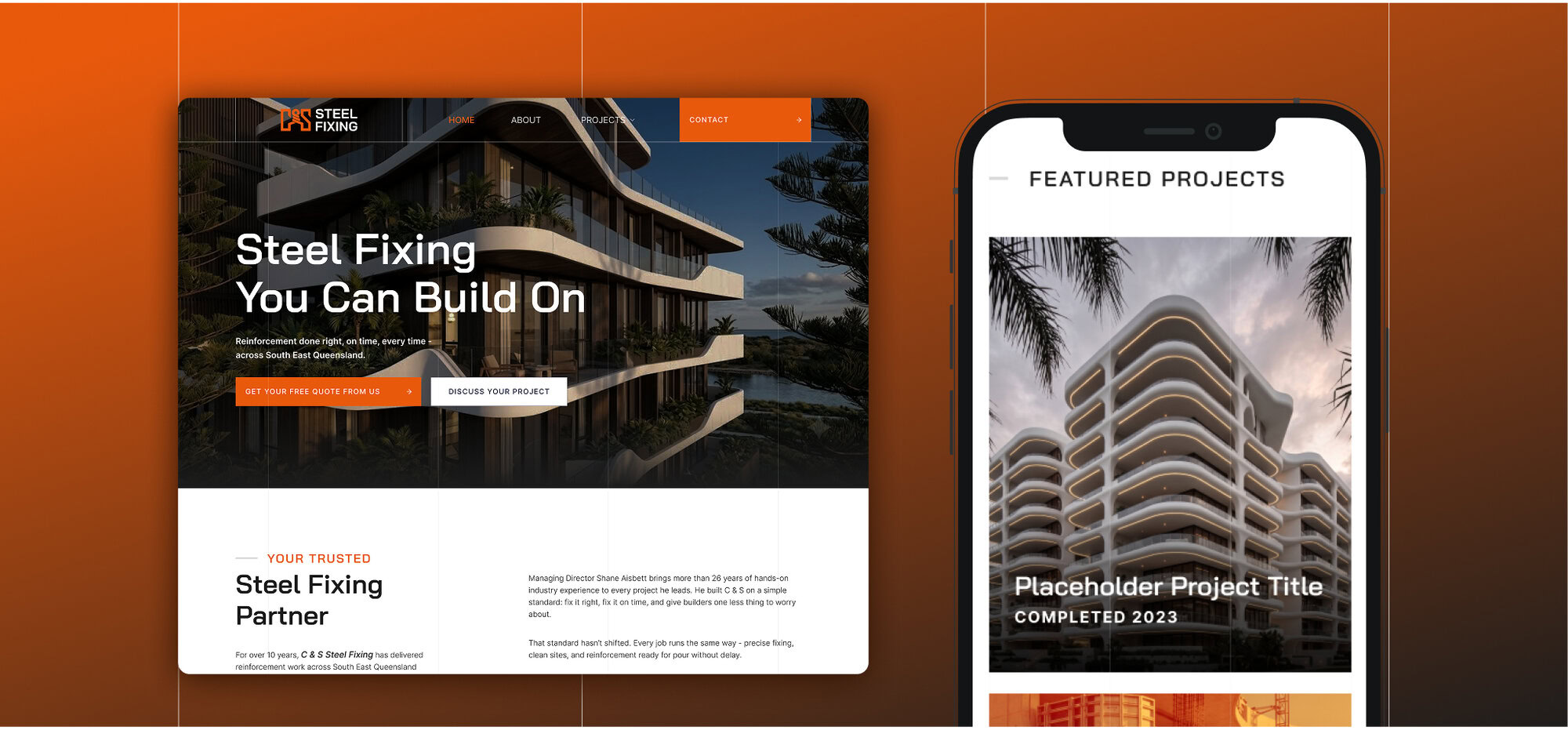
Steel fixing is not sold to homeowners. It is sold to builders, concreters and site supervisors, and most of that decision gets made on site rather than in a meeting.
In this trade plenty of crews turn up in unmarked utes and plain shirts, which makes them easy to forget and easier to replace. So we built the brand for the place the work is actually judged: a job site, in hi-vis, in dust, at a distance.
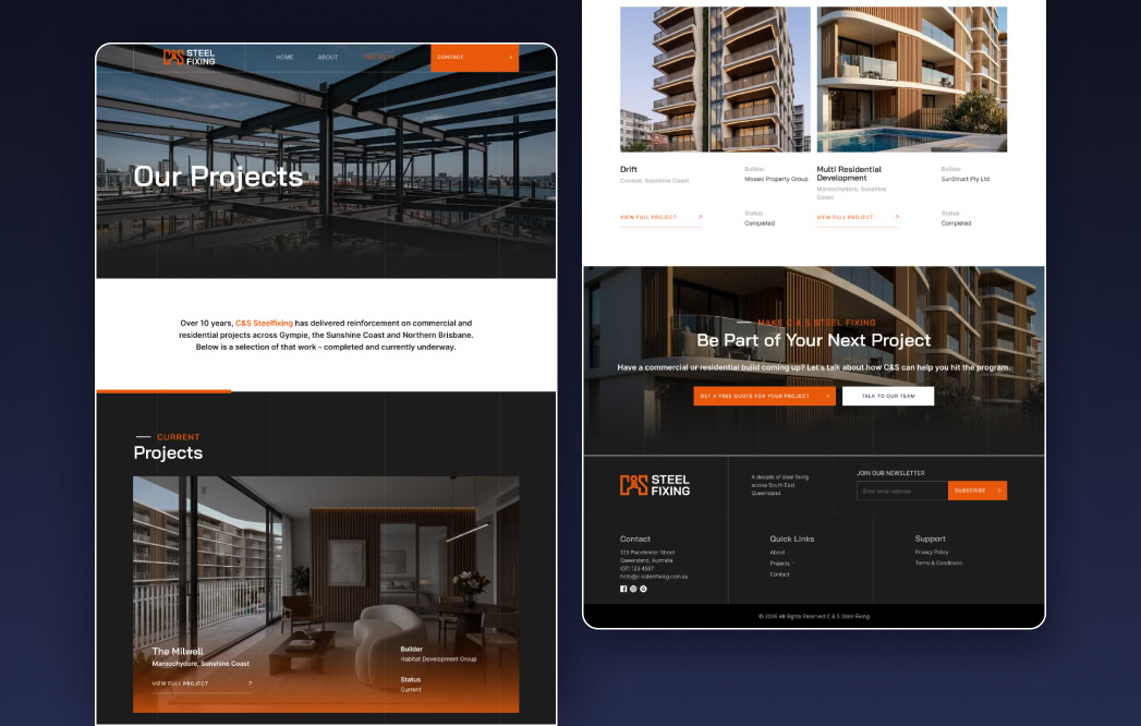
Everything runs on one idea. A crew that looks organised looks safe, and a crew that looks safe gets asked back.
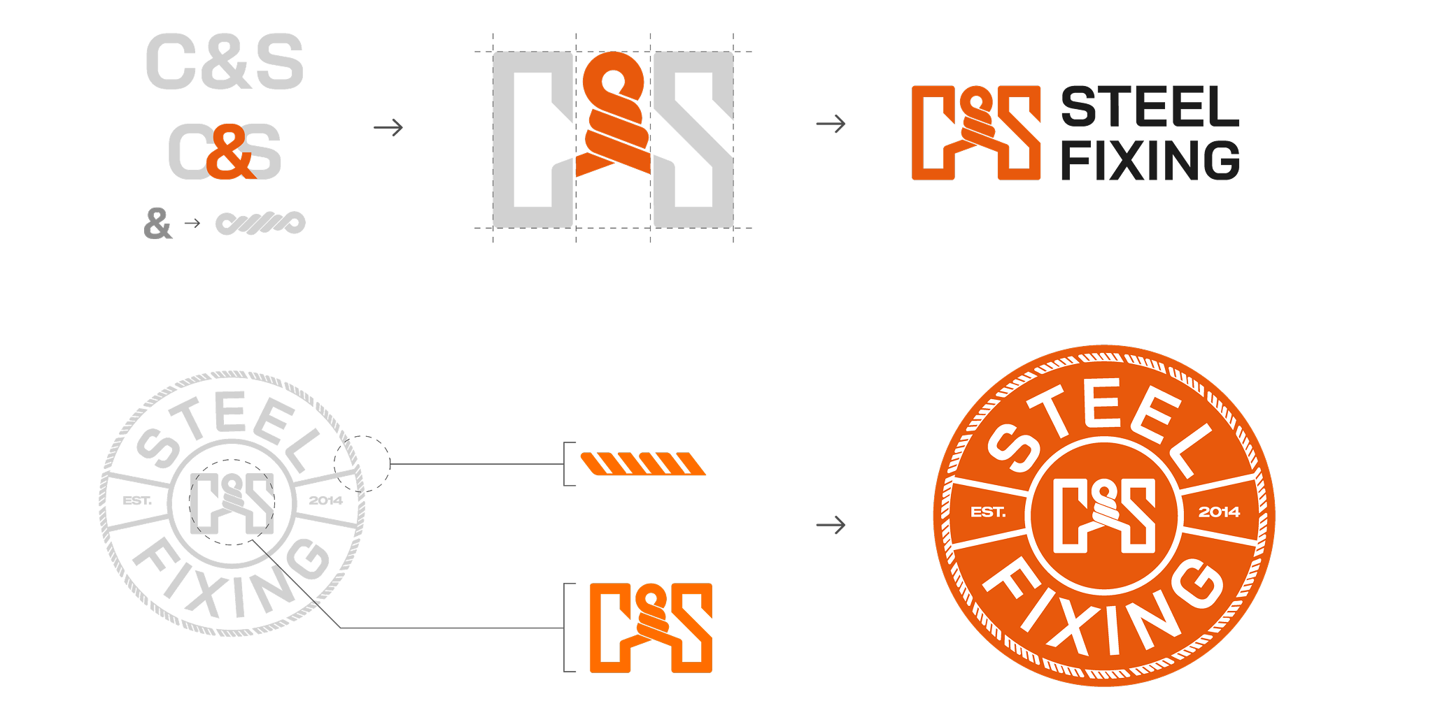
The mark puts the job in the middle of the name. Two heavy letterforms, C and S, with the ampersand drawn as tie wire twisted around a bar, which is exactly what a steel fixer does all day.
The badge builds on that. The mark centred, STEEL FIXING wrapped around it, EST. 2014 set across the middle, and an outer ring textured like the ribbing on reo bar. It gives the business a stamp, which is what a shirt pocket, a cap and a ute door need, since a horizontal lockup shrinks to nothing at that size.
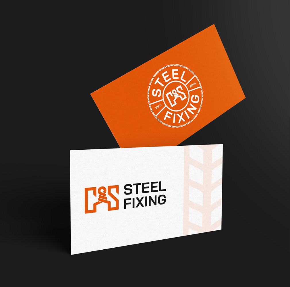
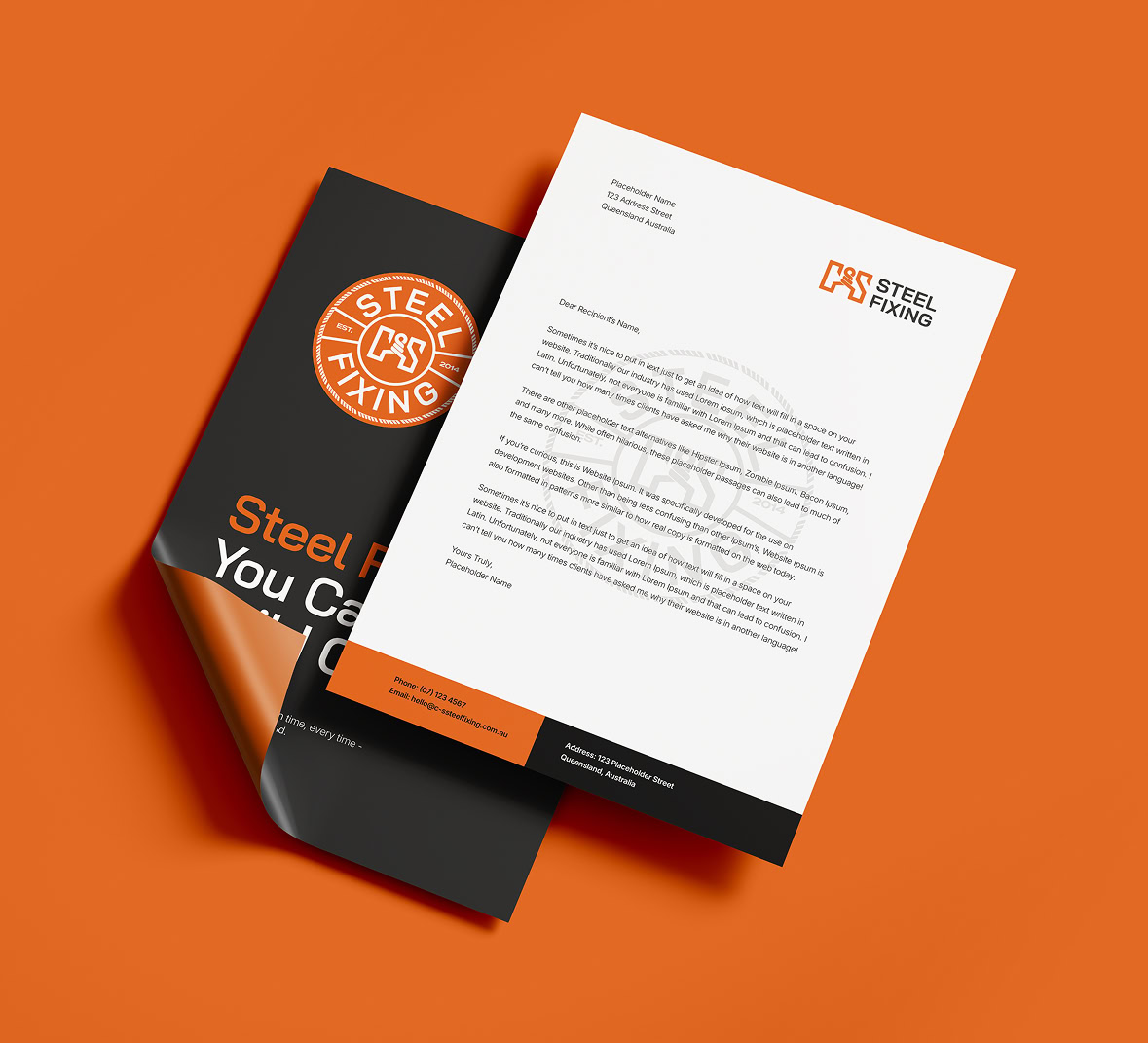
So there are three tools rather than one. The full lockup for documents and signage, the mark for small and single colour work, and the badge for anything that should look earned.
Bai Jamjuree takes the headlines and subheadlines. Squared off and slightly technical, it looks like it came off a spec sheet rather than a mood board, which suits a trade that works to drawings and tolerances.
Inter does the body copy. It was made for screens, so it stays clear in a quote, a compliance form, or a website someone opens on their phone in a site office.
Subheadline
This is just a placeholder headline
This is just placeholder text. Don’t be alarmed, this is just here to fill up space since your finalized copy isn’t ready yet. Once we have your content finalized, we’ll replace this placeholder text with your real content.
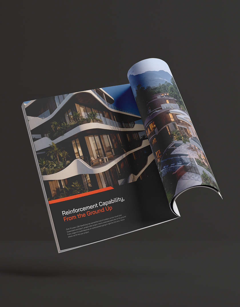
Hi-vis orange, and nothing that argues with it
The orange is the palette. It is the colour of safety gear, so on site it reads as belonging rather than advertising, and it holds up in dust, at distance and in bad light.
Everything else stays out of the way. Near-black for weight and type, a structural navy for depth where orange would be too much, and two greys for backgrounds and detail.
One loud colour and four quiet ones is the whole discipline. It is why the identity still reads the same on a black cap, a white ute and an orange polo.
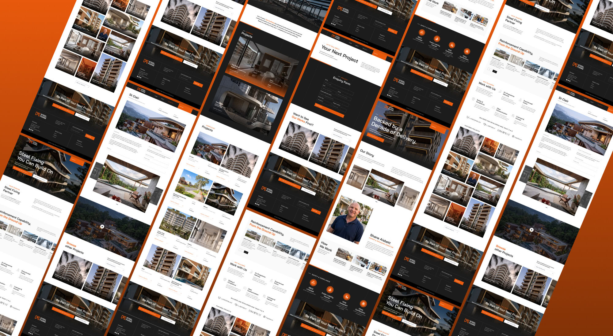
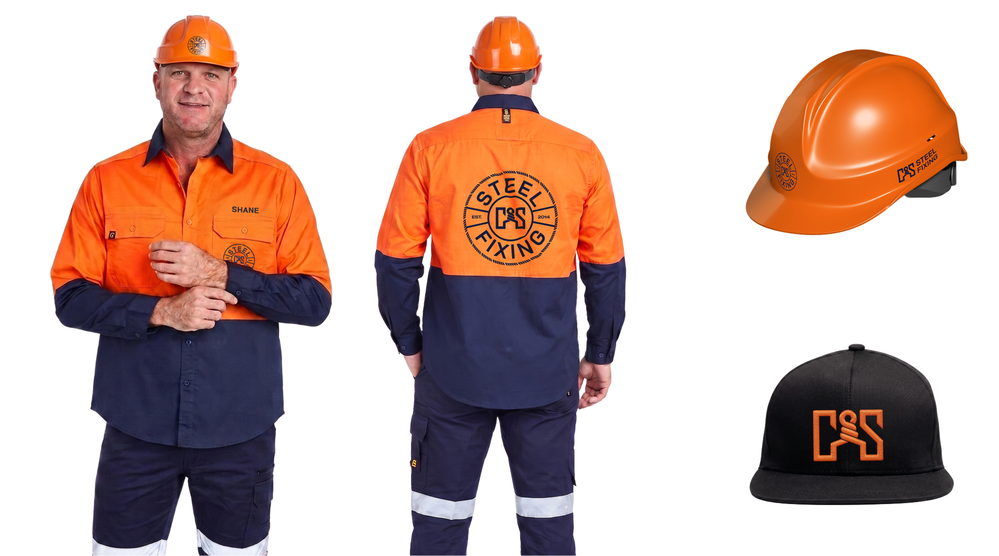
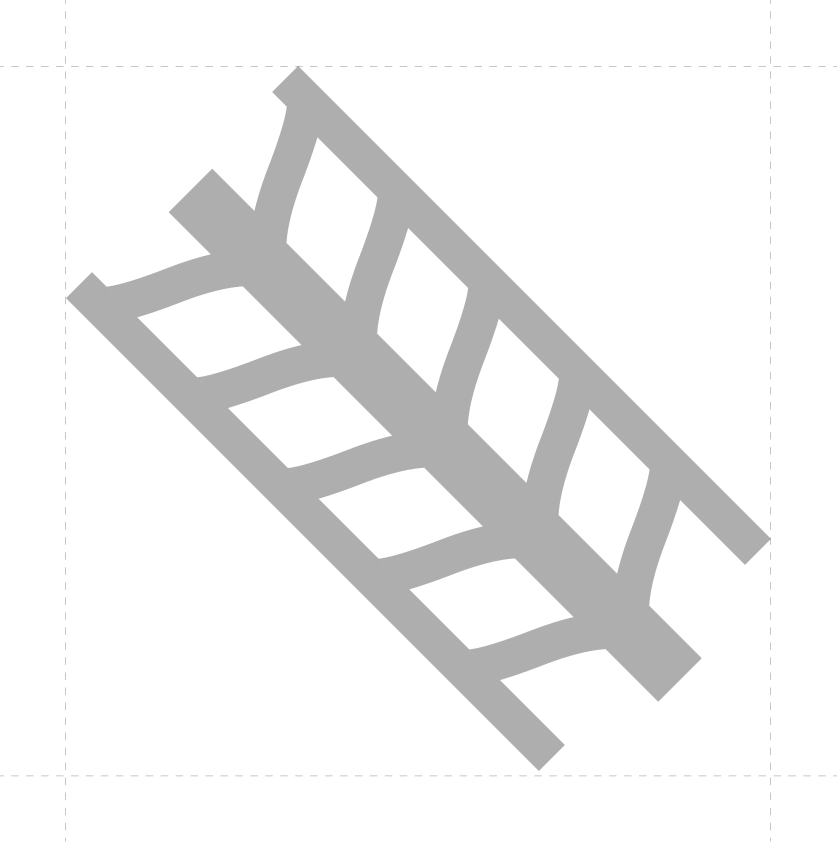
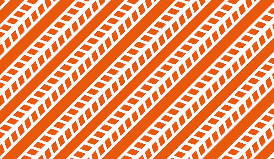
The pattern is the rebar taken out of the mark and repeated on a diagonal until it reads as a run of tied reinforcement.
Set on that angle it suggests motion and hazard striping at the same time, which is the right note for this trade.
It also does what a flat colour cannot. On a ute panel or a sleeve it fills space with something that belongs only to this business, so a vehicle can be recognised from the pattern alone, well before the badge is close enough to read.
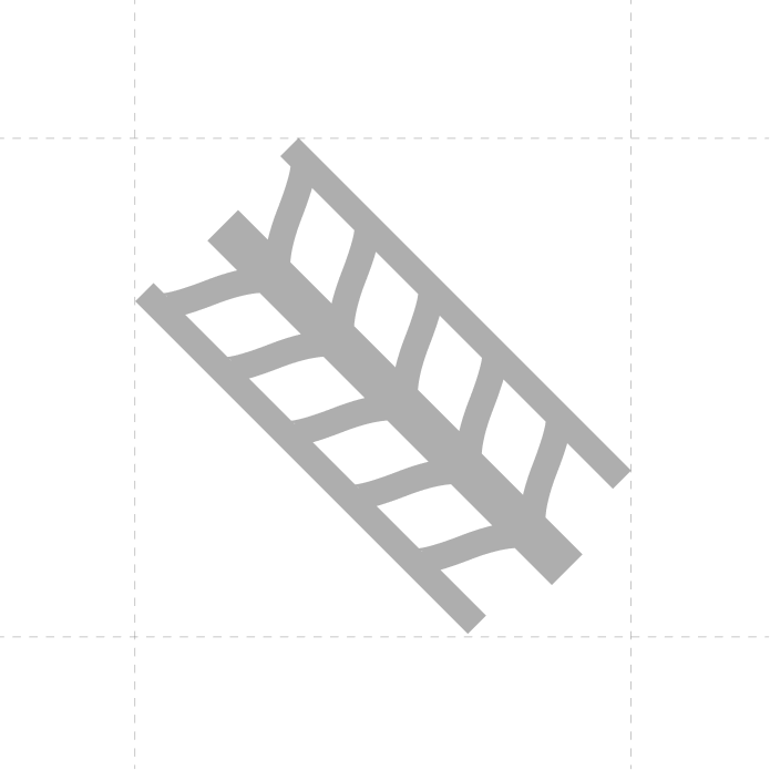
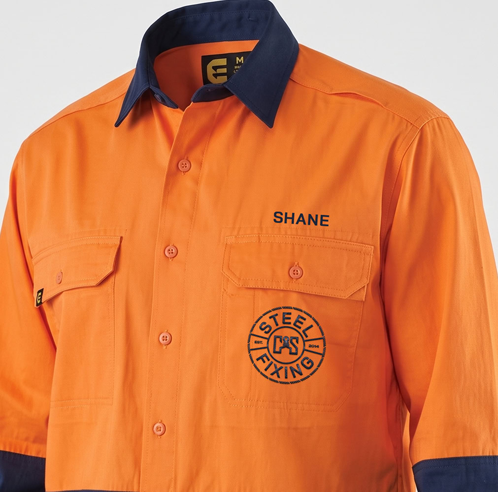
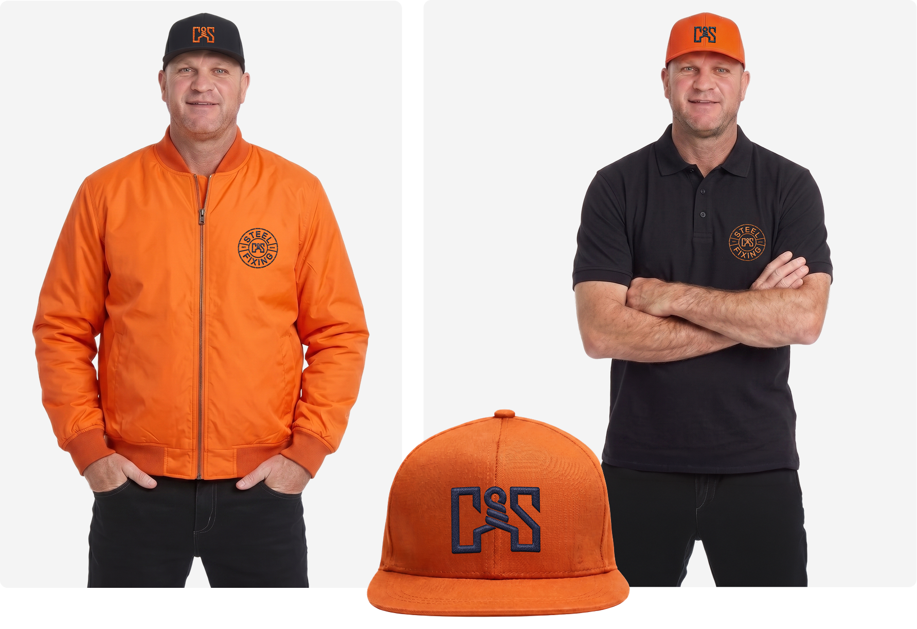
Most of this brand’s working life is spent on people, so apparel got the most attention.
Polos in brand orange with the badge at the chest. Black caps with the mark embroidered in orange. Everything specified, so a new crew member gets kitted out without anyone having to make a decision.
The utes carry the badge on the door, the pattern as a diagonal panel behind the cab, and the website in a single orange band along the tray. Parked in a street of unmarked work vehicles, it is the one that looks like a company.

This is just placeholder text. Don’t be alarmed, this is just here to fill up space since your finalized copy isn’t ready yet. Once we have your content finalized, we’ll replace this placeholder text with your real content.
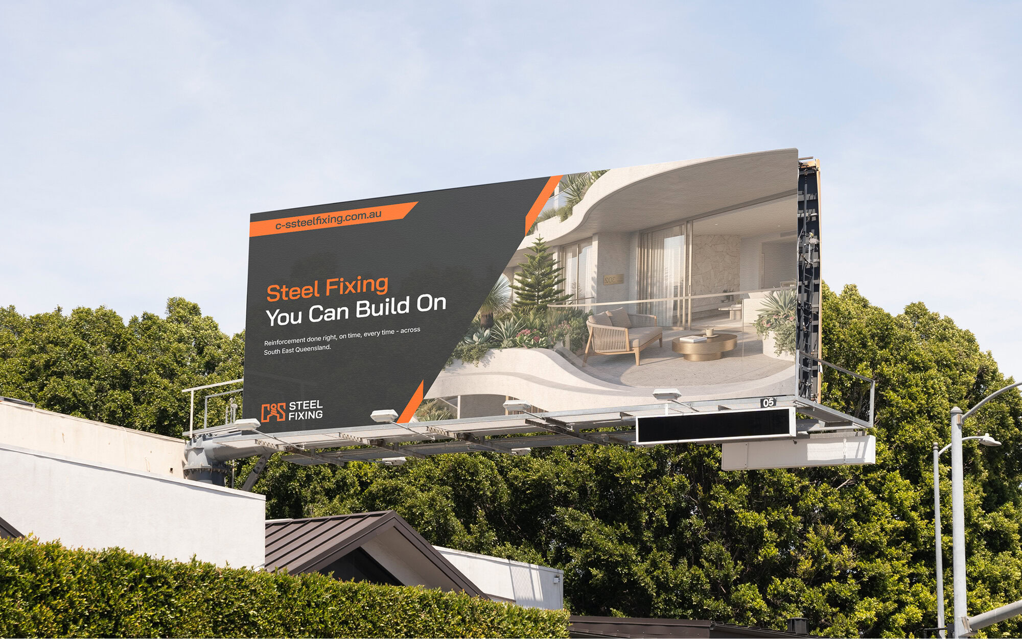
Bring us your logo, your signage, and your site. We will tell you what is working, what is not, and what we would fix first.